


Whatever you need, there’s always a Yesser for it.
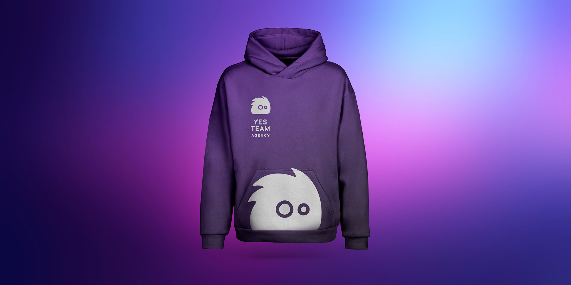
YES TEAM AGENCY is a staffing agency providing people for events, hospitality, promotions and everything in between.
When two companies merged to become one team, they needed more than a new logo. They needed a new identity—something energetic, approachable and impossible to confuse with another staffing agency.
Two companies. One new team.
The merger was a chance to start fresh.
The new YES TEAM needed an identity that could bring everything under one name, feel representative enough for the clients hiring them and still connect with the young, energetic people working at events.
Most importantly, it couldn’t disappear into a sea of ordinary staffing agencies.
It needed a personality of its own.
And, as it turned out, one personality wasn’t going to be enough.
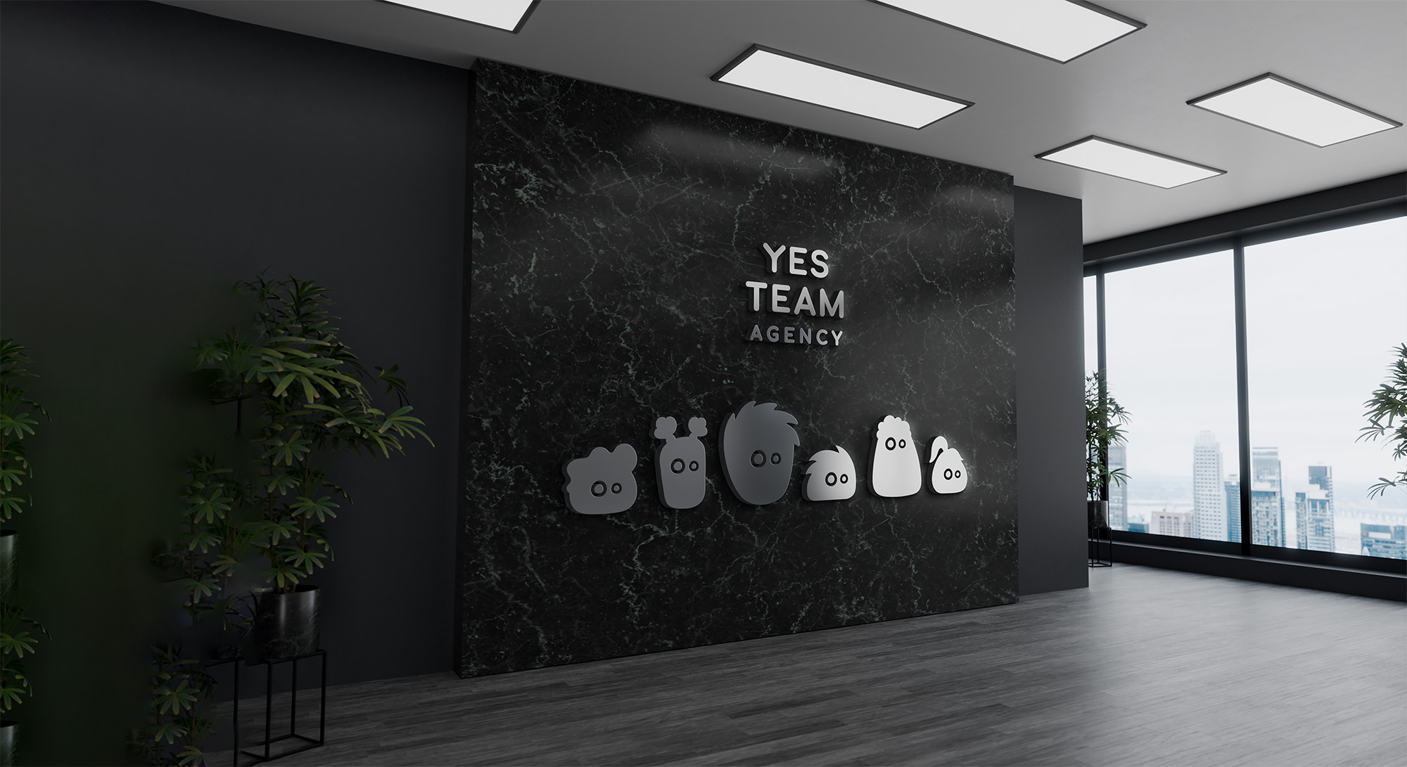
So we made a whole team.
Meet the Yessers.
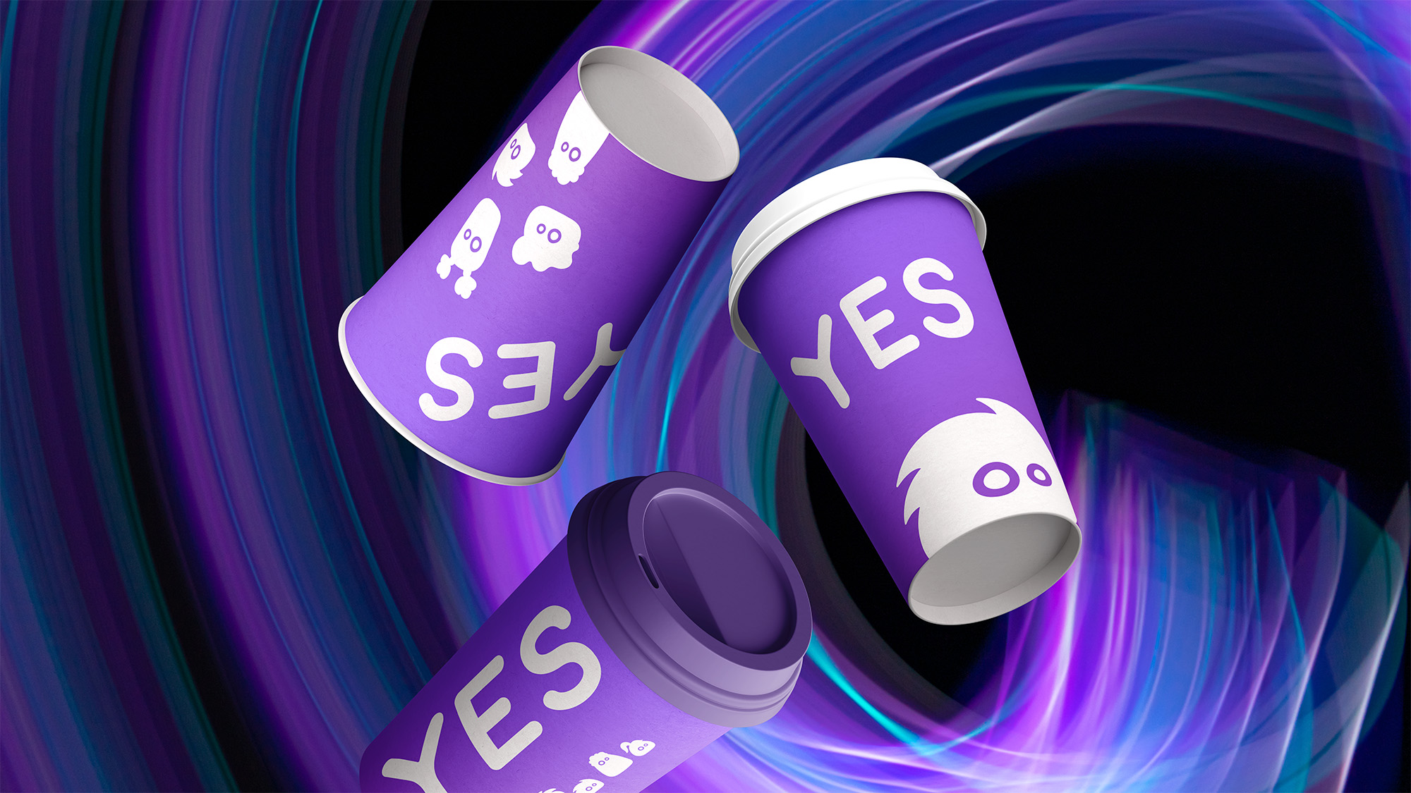
A group of characters created especially for YES TEAM AGENCY. Every Yesser represents a different type of person you might need on your team.
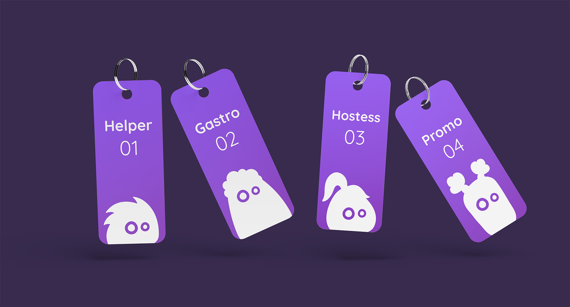
There's a Yesser for gastro.
A Yesser for hostessing.
A Yesser for helping out.
And more whenever the team needs to grow.
Different roles. Different personalities. One thing in common:
They’re ready to say YES.
The logo became one of them.
Part of the same visual world.
Instead of creating a symbol and then adding characters around the brand, we made the two part of the same visual world.
One Yesser lives in the logo.
One of the Yessers lives directly in the YES TEAM logo, alongside the typography.
They aren’t a campaign or an illustration style added on top of the identity. They are the identity.
Combined with bold purple and expressive typography, they give YES TEAM a visual language that can be playful when it wants to be, while still looking confident and recognizable.
Right person. Right vest.
The Yessers weren’t designed just to sit nicely in a brand guideline.
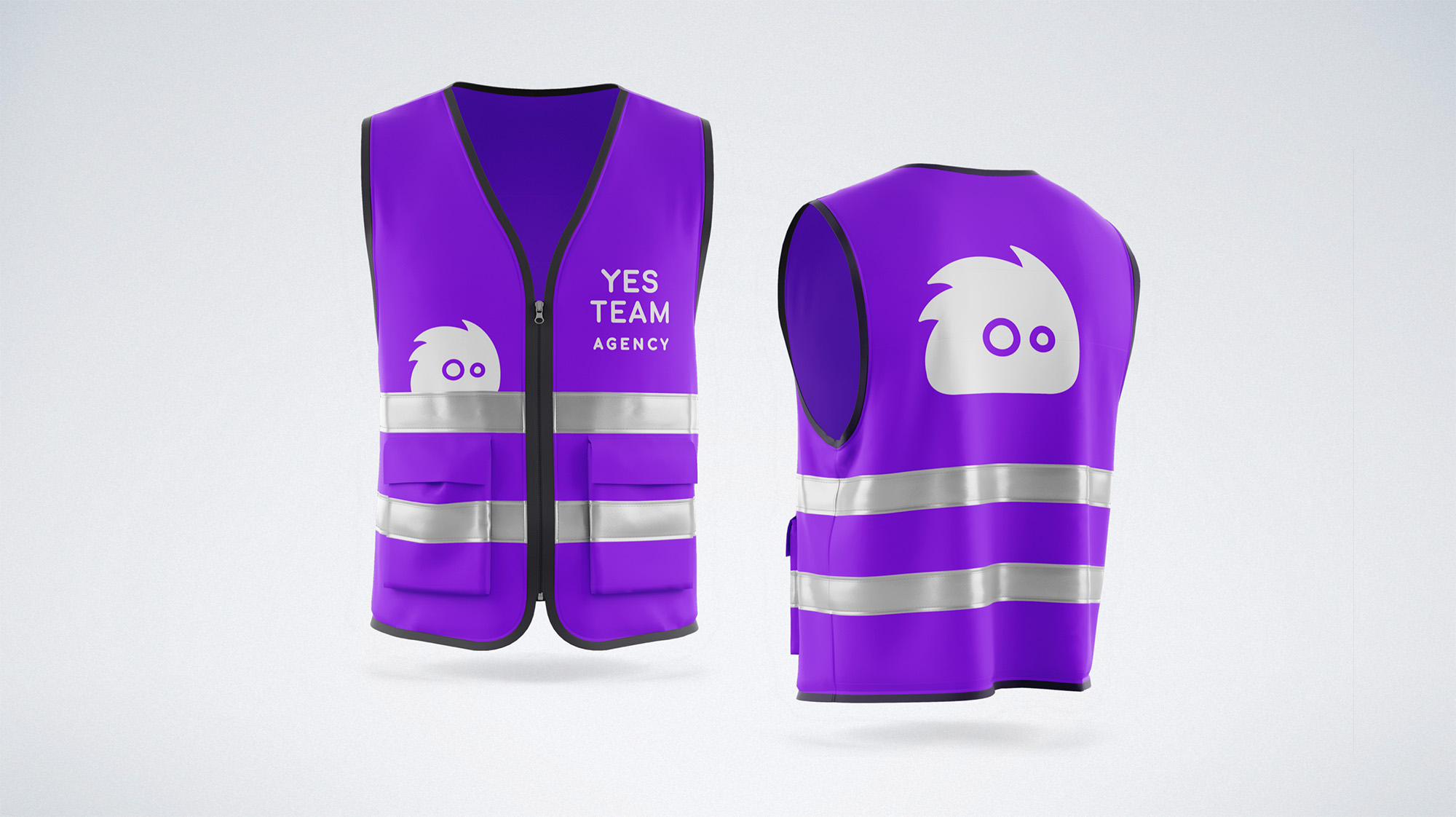
They also created a simple visual system for the actual staff. Different roles can be represented by different characters—including on the reflective vests worn by the team at events.
A gastro Yesser for gastro staff.
A hostess Yesser for hostesses.
A helper Yesser for helpers.
So something purely practical becomes part of the brand too.
And when you see a Yesser, you know you’re looking at someone from YES TEAM.
What we worked on.
Logo
Building the new YES TEAM identity around one of its own characters.
Visual identity
A bold purple visual world designed to feel young, energetic and easy to recognize.
The Yessers
A family of characters representing different staffing roles, each with its own personality while still clearly belonging to the same team.
Brand system
Creating a flexible system that allows new Yessers and staff categories to be added as needed.
Brand materials
Taking the characters beyond the logo and putting them to work across practical applications—including staff clothing and reflective vests.
Brand guidelines
Giving YES TEAM a clear system for keeping the identity consistent as the team and its materials grew.
Always say YES.
One company needed a new identity. It ended up with a whole team of characters ready for whatever job came next.
YES TEAM AGENCY · Brand by WISITLike what you see?