

Taking care of yourself should feel beautiful.

DERMABELLE brings beauty, wellness and medical skin care together under one roof—from cosmetic treatments and massages to laser treatments, vitamin drips and professional skin diagnostics.
The quality was already there.
The brand needed to look like it.
Somewhere between a clinic and a place to exhale.
DERMABELLE isn’t quite a beauty salon.
And it isn’t quite a medical clinic either.
Doctors work alongside beauty professionals. Modern technology sits next to treatments designed simply to make you feel good.
The old identity didn’t reflect any of that.
So the challenge wasn’t just to make DERMABELLE look more luxurious. It was to create a brand that could feel professional without becoming clinical, beautiful without becoming overly feminine, and premium without feeling cold.
A place you trust with your skin—and actually look forward to visiting.
DERMA meets belle .
The new name came from the two sides of the brand.
DERMA for skin, expertise and professional care.
BELLE for beauty.
Together, DERMABELLE.
Your skin doesn’t need to become beautiful.
It already is.
Sometimes it just deserves a little more care.
Look a little closer.
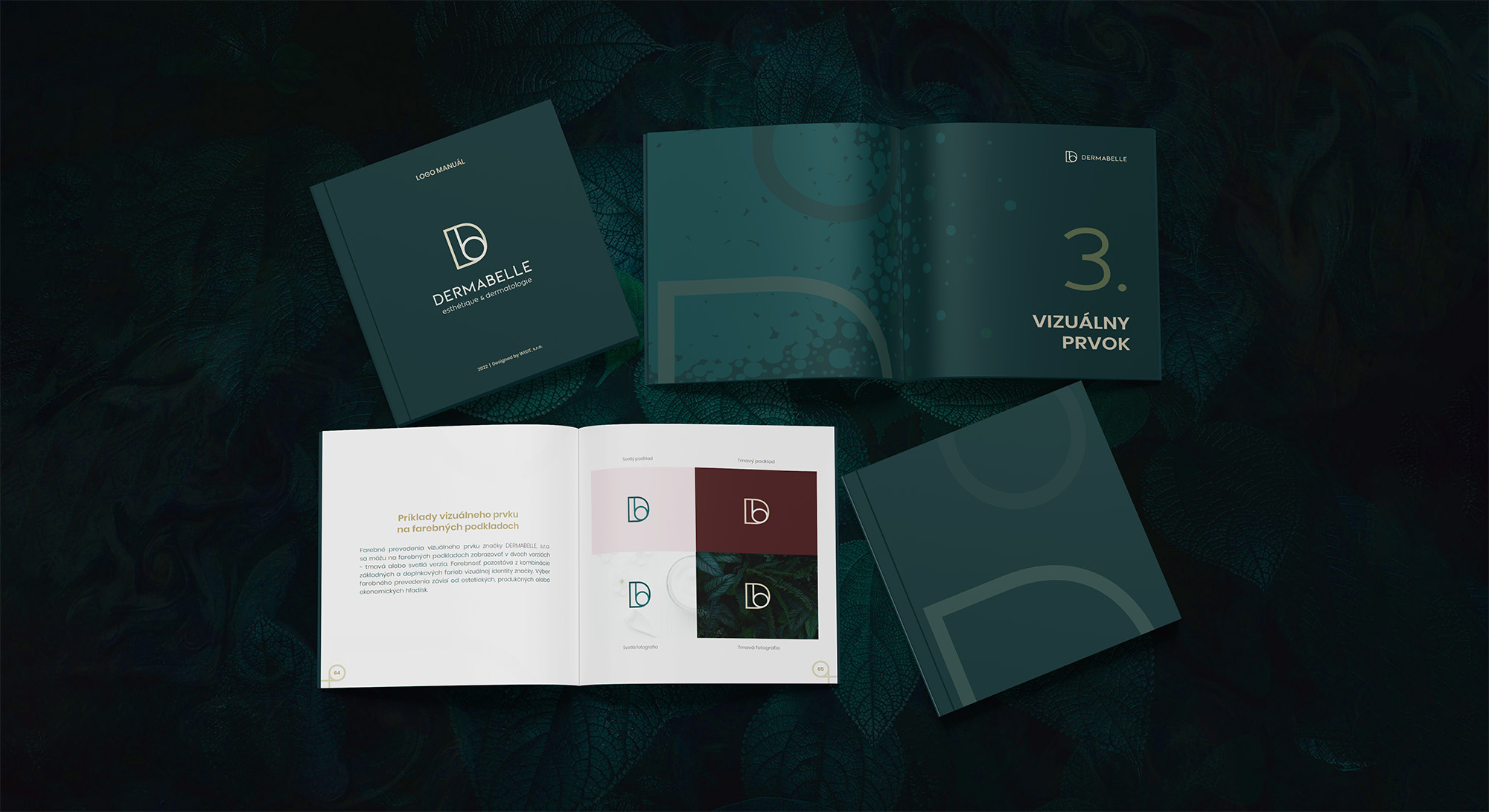
The identity follows the same idea of bringing two things together. A large D holds a smaller b, forming the DERMABELLE symbol.
The shapes come together almost like pieces of a mosaic, creating a mark that can work as both a logo and a graphic element throughout the brand.
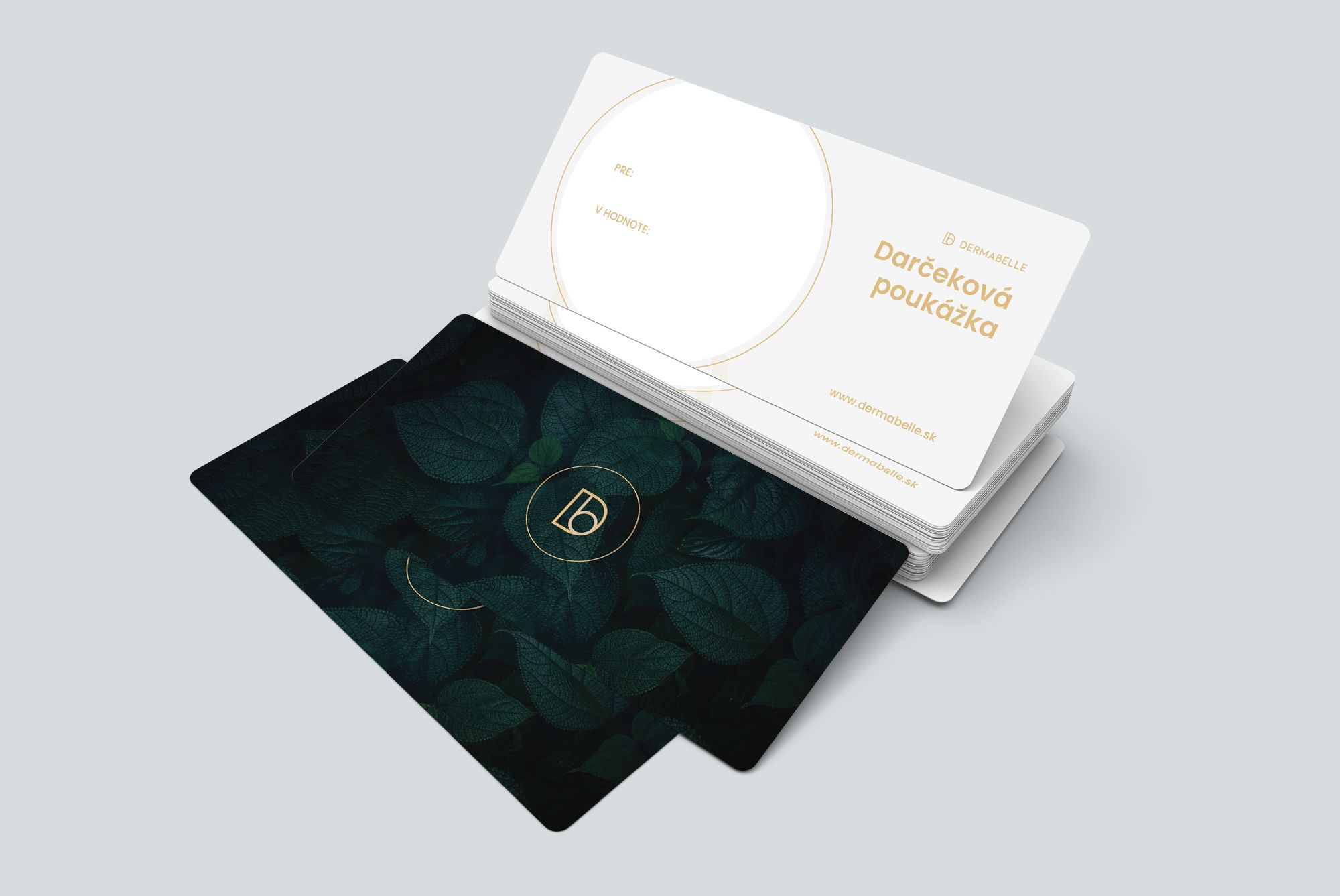
Dark green and gold bring in the sense of luxury, while rich natural textures and leaves keep the identity connected to calm, nature and taking a moment for yourself.
The result sits somewhere between art, wellness and medicine.
Exactly where DERMABELLE belongs.
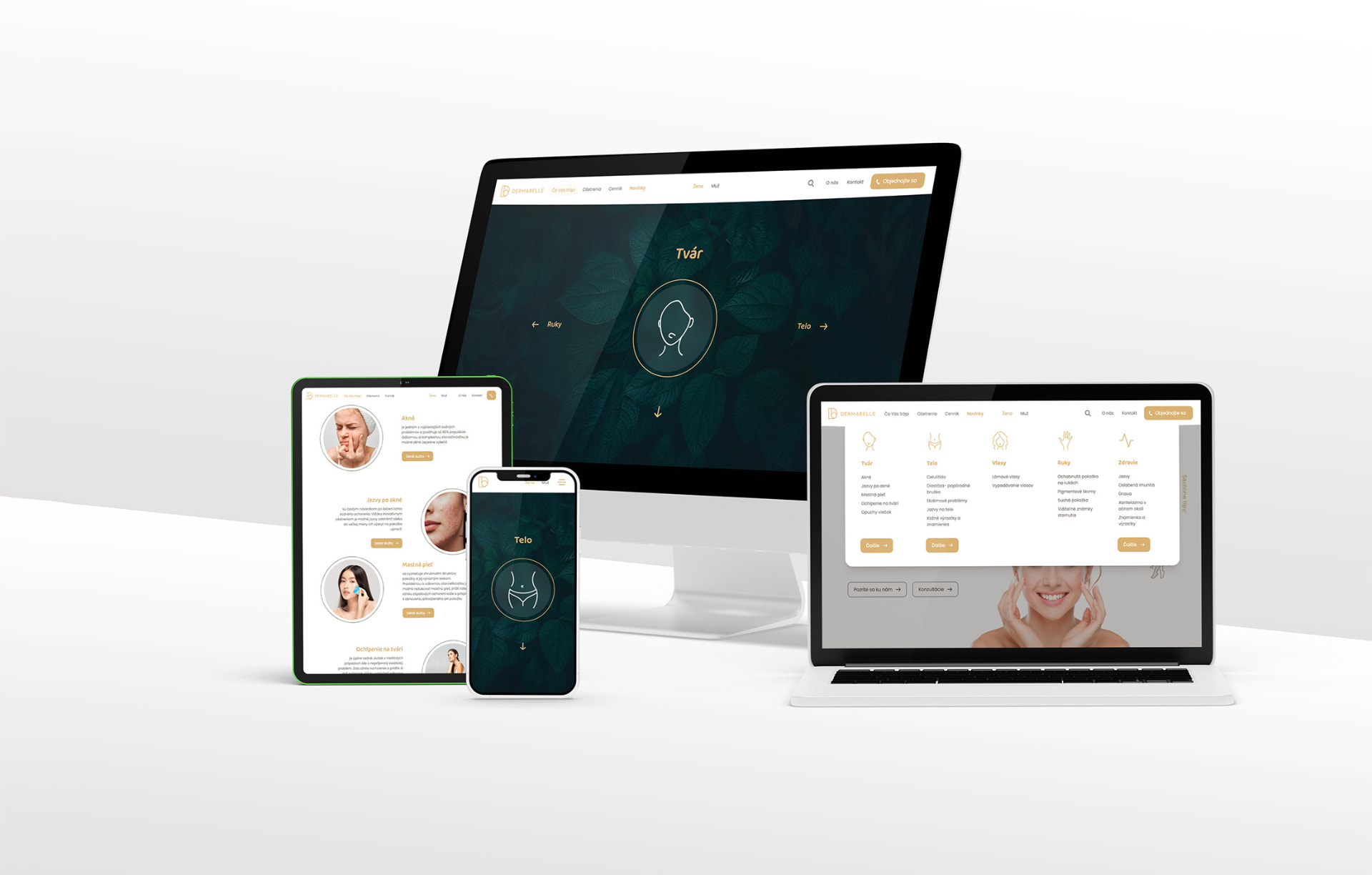
Not your usual clinic website.
The same feeling needed to continue online.
DERMABELLE offers a wide range of treatments, from relaxing cosmetic care to services involving doctors and specialist technology. The website had to make all of that understandable without turning into a clinical catalogue of procedures.
So we balanced clear UX and treatment information with large imagery, movement and animation.
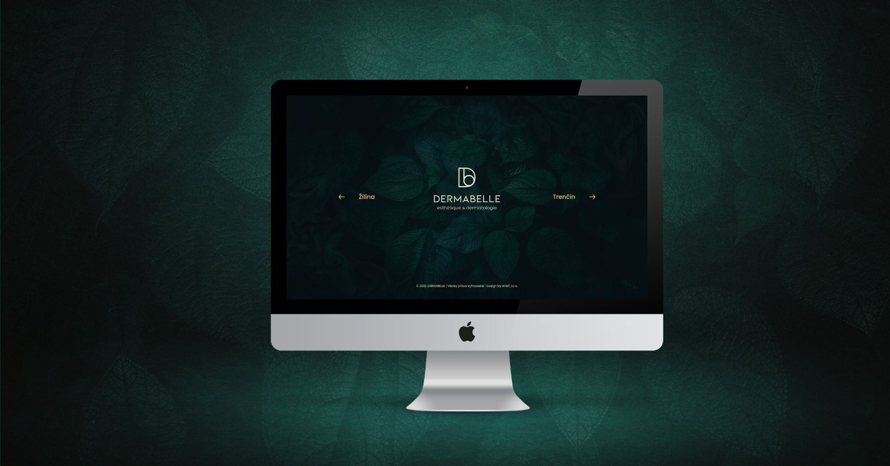
Even the logo comes to life.
The goal was for the website to feel less like browsing a medical directory and more like entering the DERMABELLE space itself.
Calm. Modern. A little unexpected.
What we worked on.
Naming
Bringing together DERMA and BELLE to represent the meeting point between professional skin care and beauty.
Logo
Combining a large D and smaller b into a mosaic-like symbol that became the centerpiece of the identity.
Visual identity
Dark green, gold, natural textures and rich imagery creating a visual world somewhere between luxury wellness and modern skin care.
Brand guidelines
Creating the system for keeping DERMABELLE recognizable across digital and physical applications.
Print materials
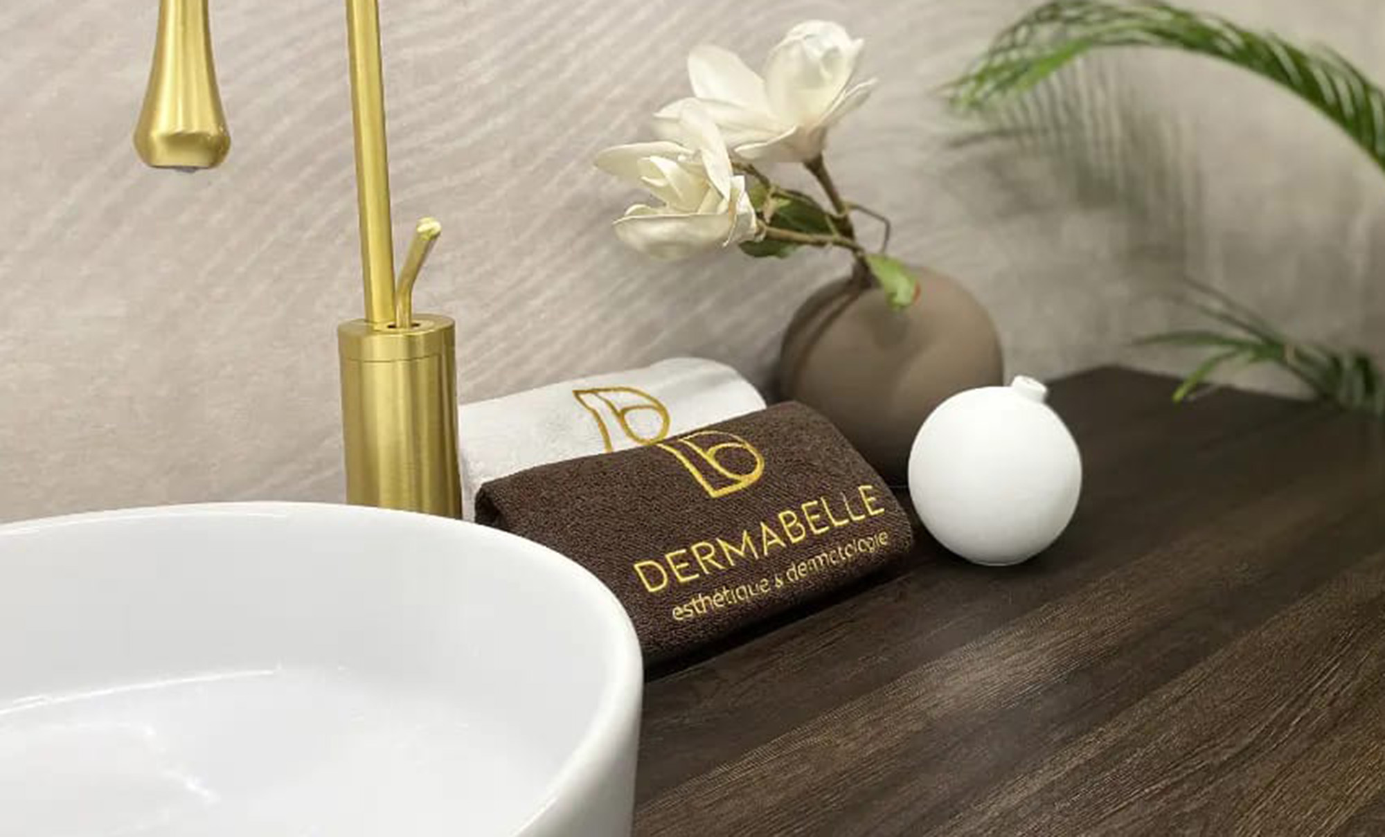
Extending the identity into the materials clients encounter inside and outside the salon.
UX/UI
Organizing a broad range of treatments and specialist services into an experience that's easy to understand and navigate.
Website
Bringing the visual identity online through imagery, movement and animation while keeping treatment information clear and accessible.
More than skin deep.
DERMABELLE was already offering a level of care worth feeling good about. Now it had a brand designed to feel the same way.
DERMABELLE · Brand by WISITLike what you see?