

How do you celebrate 100 years without feeling 100 years old?

Comenius University was turning 100.
Instead of looking only backwards, 100 Years with Amos turned the anniversary into a day of exhibitions, conversations, workshops and things to discover about the university.
With one very recognizable host. Meet Amos.
100 years is a lot to talk about.
A century of university life means a century of people, research, discoveries, stories, changes and probably quite a few things even the people studying there don’t know.
So the anniversary wasn’t designed as just another ceremony. The main university building became a place to explore.
Talks.
Discussions.
Workshops.
Activities.
An exhibition.
Everyone, meet Amos.
The event didn’t need a traditional anniversary logo. It had Amos.
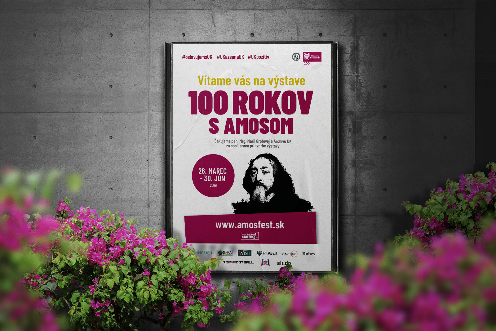
Amos became the face of the celebration and the central element of the visual identity. We treated his image almost like an artwork. Bold, expressive and intentionally contemporary.
The university’s own dark red and white became the dominant palette.
A 100-year celebration without looking like it came from 100 years ago.
And then Amos showed up.
Not just on posters.
Visitors could meet a living version of Amos at the event itself. A live statue brought the central character of the campaign into the physical celebration.
The face they’d seen throughout the campaign was suddenly standing in front of them.
100 questions for 100 years.
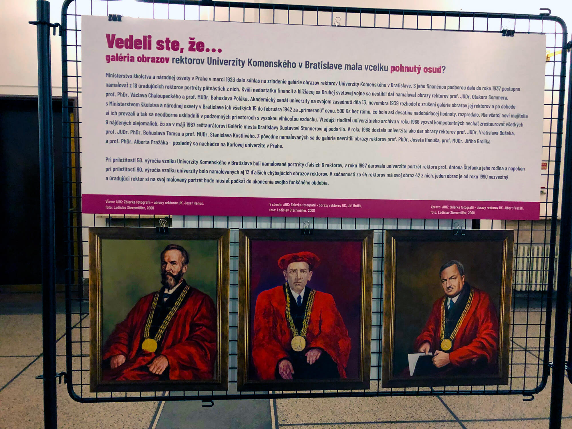
Instead of creating an exhibition where people simply walked around reading facts, we turned the university’s history into something they could guess.
100 questions.
100 answers.
100 years.
The anniversary became less of a history lesson and more of a conversation.
Go on. Take a guess.
The questions gave the exhibition a reason to be explored rather than simply observed.
Some answers you might know.
Others you might think you know.
And some would probably surprise you completely.
Don’t just tell people about 100 years. Give them something to do with them.
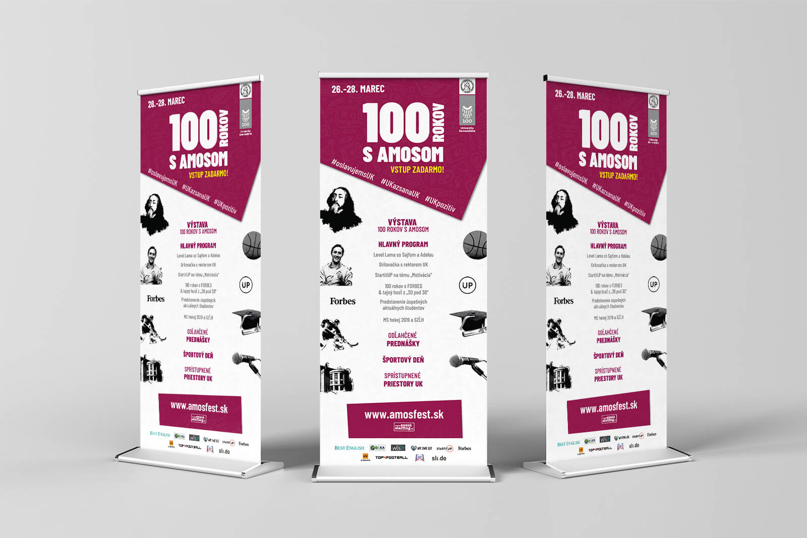
One Amos. Everywhere.
The identity needed to move well beyond a poster. Using one strong visual character made it possible for very different pieces of communication to still clearly belong to the same event.
Social media.
Campaign materials.
Posters.
The exhibition.
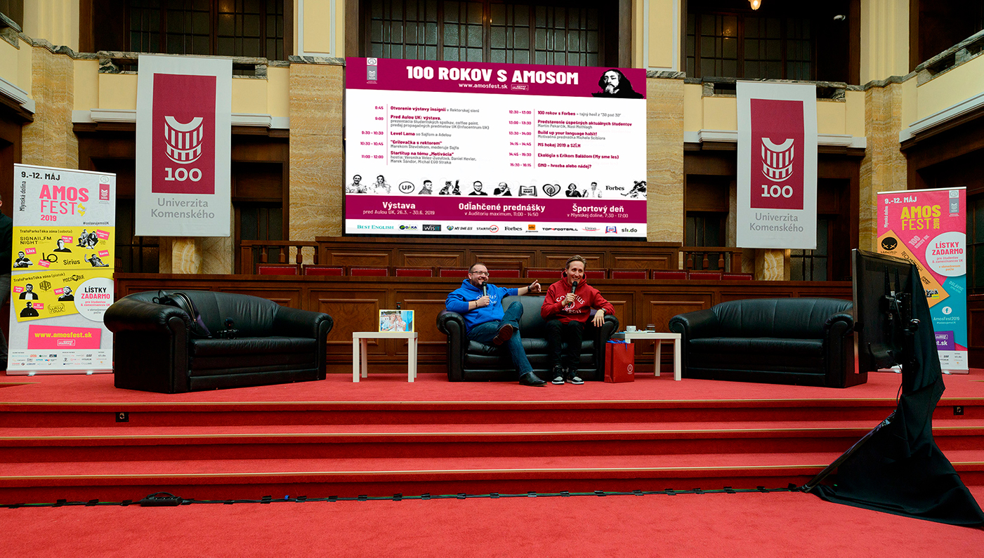
Stage graphics.
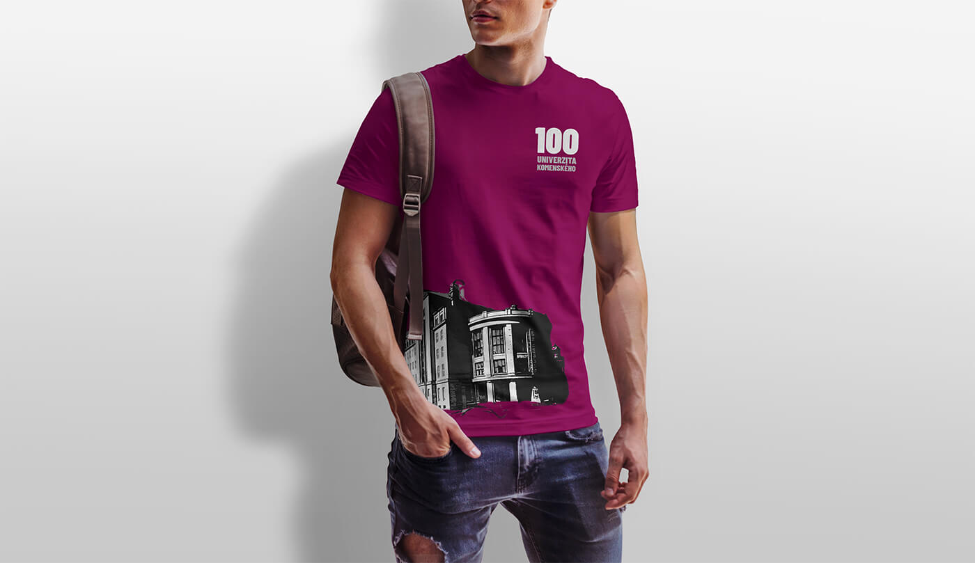
T-shirts. Print. The university itself.
University red. Just less university-like.
We kept the familiar dark red and white connected to Comenius University. But the way we used them changed.
Combined with the artistic treatment of Amos, the traditional colors could suddenly feel much more contemporary, expressive and appropriate for professors, students and the wider public too.
Familiar colors. Very different energy.
What we worked on.
Event concept
Turning the university’s centenary into an experience built around discovery, participation and conversation.
Amos visual concept
Making Amos the recognizable face of the anniversary instead of creating another traditional centenary mark.
Visual identity
Building a contemporary event language around artistic imagery and the university’s dark red and white.
100 Questions / 100 Answers
Turning 100 years of university history into something visitors could guess and explore.
Campaign & communication
Extending the identity across social media, posters, print and promotional materials.
Event applications
Bringing the visual world into the exhibition, stage, merchandise and Amos himself.
100 years. Still curious.
A university anniversary naturally looks backwards. We wanted this one to still feel interested in what’s next.
We turned 100 years into questions, conversations and an event people could actually be part of.
100 YEARS WITH AMOS · EVENT CONCEPT & VISUAL IDENTITY BY WISITLike what you see?