
Coffee. Food. And maybe your next big idea.

Makanan was a café built around meeting.
A cozy place for coffee, breakfast and fusion food, but also somewhere business people could sit down, talk and see what came out of it.
The slogan said it simply: Let’s meet!
More than “let’s grab a coffee.”
Some meetings have an agenda. Some start with: “Do you have time for coffee?”
Makanan was created for both.
The idea was to build a relaxed meeting point for business people. A place where conversations could happen, people could connect and new ideas could start somewhere between the first coffee and an unexpectedly long lunch.
Professional enough for a meeting.
Comfortable enough to stay.
A meeting point with a menu.
Let’s
meet!
That became the simplest expression of the whole concept.
Meet a colleague.
Meet a client.
Meet someone new.
Meet for breakfast.
Meet for coffee.
Meet to talk through an idea that might turn into something much bigger.
Makanan wasn’t supposed to be a place where you simply bought something and left.
Meeting was the point.
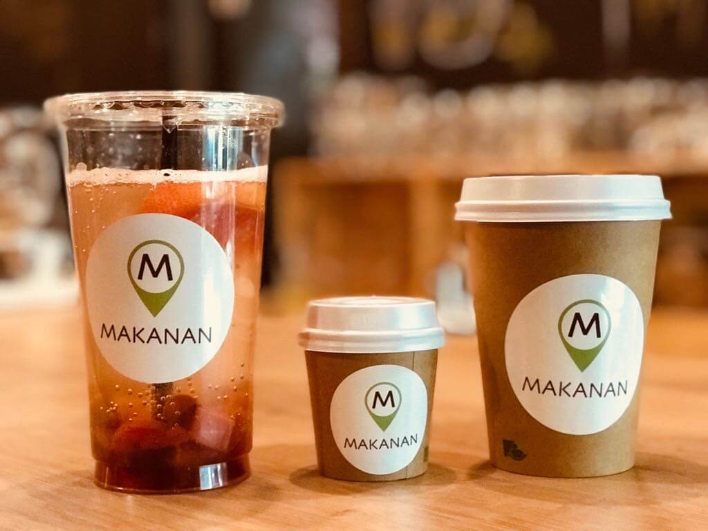
So we made the logo a meeting point.
The M became the center of the identity.
We placed it inside a large meeting-point symbol, creating a mark designed to work almost like the symbol for a metro station.
Something simple.
Visible.
Recognizable from a distance.
The original ambition was for Makanan to grow beyond a single café and become a meeting point people could recognize in cities across Europe.
See the M. Meet at Makanan.
You know where to meet.
The logo wasn’t supposed to be a complicated illustration of coffee or food.
No cup.
No bean.
No fork.
The café wasn’t really built around any of those things. It was built around people coming together.
So that’s what the identity represented.
A little bit of everything.
Makanan’s menu followed the same open-minded approach.
Coffee.
Breakfast.
Cakes.
Salads.
Sushi.
And other fusion specialties.
It wasn’t trying to belong to one particular cuisine or culture. The idea was to create a place where different things could comfortably exist together.
A little like the people sitting around the tables.
Today’s special: something to talk about.
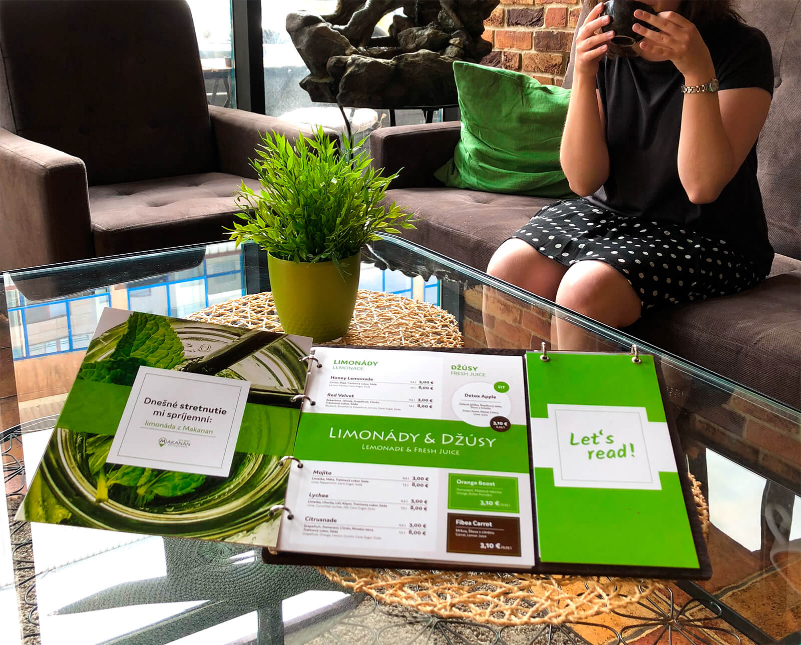
The menu became one of our favorite parts of the identity.
Because if Makanan was supposed to be a place for conversations and ideas, we thought the menu could do more than tell you what was for lunch.
So alongside the food and drinks, we included daily news and interesting things happening around the world.
Something to read while waiting.
Something you might not have known.
And maybe—something to start a conversation about.
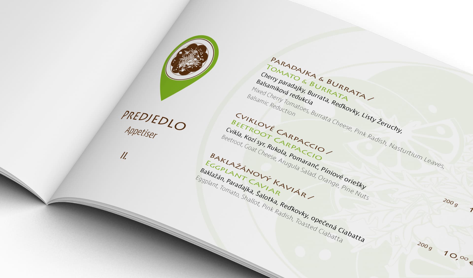
A menu with conversation starters.
That small idea turned an everyday café object into part of the wider concept.
You came to Makanan to meet. The menu gave you something else to talk about.
Business.
Culture.
Something happening on the other side of the world.
Or, eventually, what you're actually going to order.
Cozy enough to stay.
The identity used brown and green to support the atmosphere Makanan wanted to create.
Warm.
Relaxed.
A little premium.
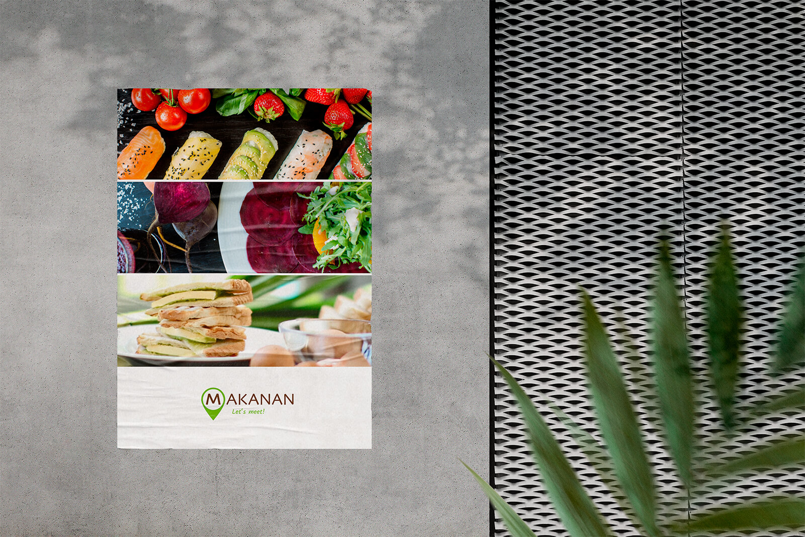
The brand then moved throughout the physical café—from menus and walls to cups, napkins and signage.
The goal wasn’t to create somewhere that felt aggressively corporate just because business people were the audience. Quite the opposite.
Good ideas need somewhere comfortable to happen.
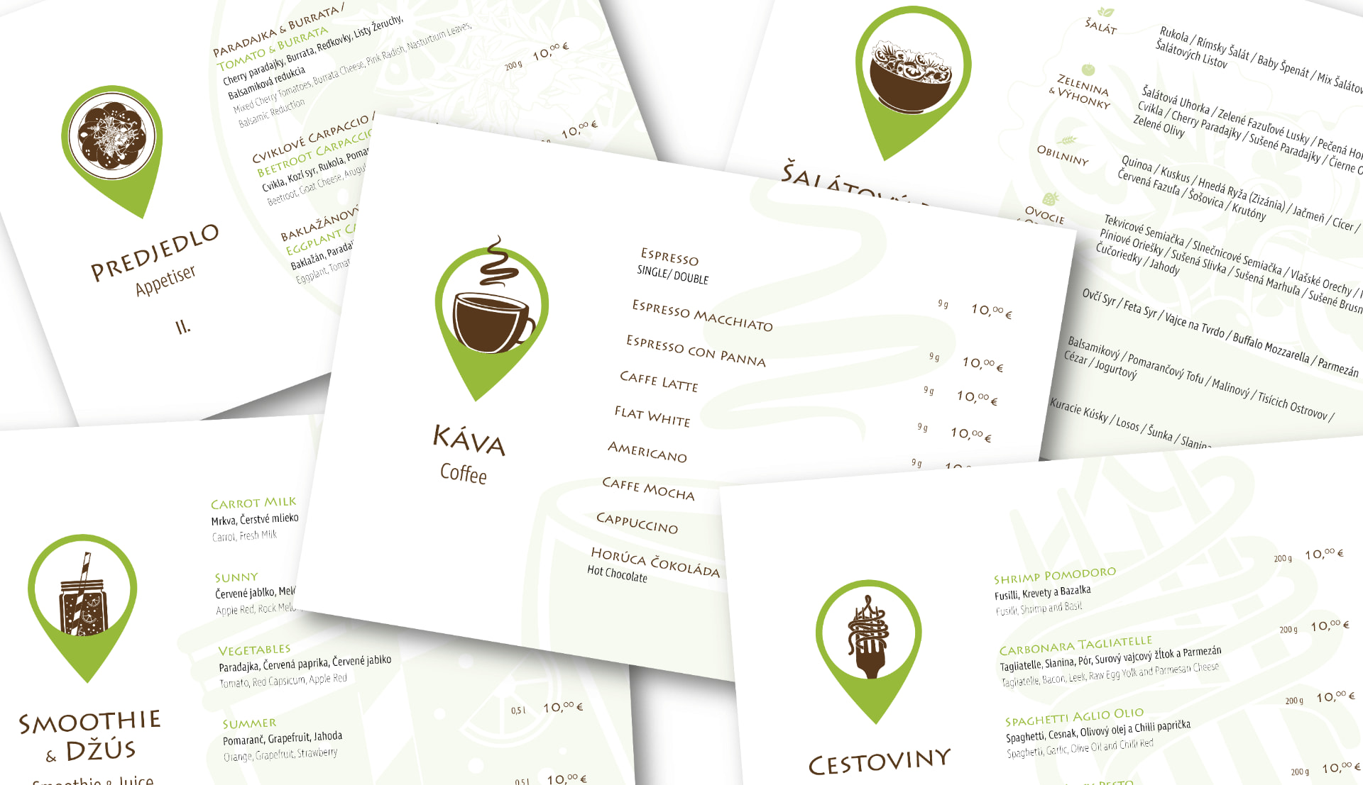
What we worked on.
Logo
Turning the M into a recognizable meeting-point symbol designed to become a landmark of its own.
Visual identity
Creating a warm, premium and relaxed visual world around brown, green and the central M.
Brand concept
Building the identity around Makanan as a place for people, conversations and ideas, not simply coffee and food.
Menus
Creating an unconventional menu that combined food and drinks with daily news and conversation starters from around the world.
Physical applications
Bringing the identity into the café through signage, walls, cups, napkins and other everyday touchpoints.
Let’s meet.
For coffee. For lunch. For business. For an idea. Or just because it’s a nice place to be.
That was Makanan.
MAKANAN · LOGO, VISUAL IDENTITY & MENUS BY WISITLike what you see?