


Finding balance, naturally.

LB Academy was a Slovak community built around an unusual combination: essential oils, communication and personal development.
The name stands for Life Balance.
So that’s exactly where we started.
Two sides of feeling better.
LB Academy approached personal development from two directions.
How we communicate with other people.
How we work with ourselves.
Its programs brought communication and personal-development practices together with essential oils and aromatherapy as part of a broader approach to everyday wellbeing.
Different disciplines. One idea connecting them: Balance.
LIFE
BALANCE
The meaning was already hiding in the name. LB = Life Balance.
So for the new identity, we wanted to turn that idea into something people could see.
The symbol takes inspiration from scales, two sides finding equilibrium around a central point.
Simple.
Symmetrical.
Balanced.
Just like the idea behind the academy itself.
And there’s a drop hiding inside.
Balance wasn’t the only thing the logo needed to represent. Essential oils were a central part of LB Academy.
So the geometry of the symbol also incorporates the shape of an oil drop.
Balance + essential oils.
The philosophy of the academy and one of the tools associated with it, reduced to a single symbol.
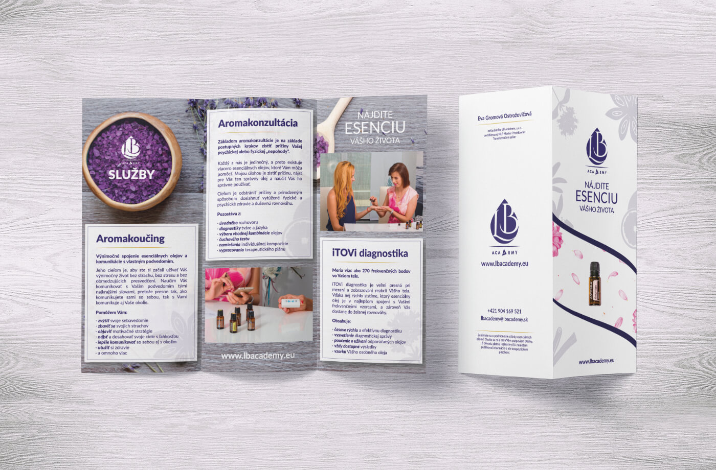
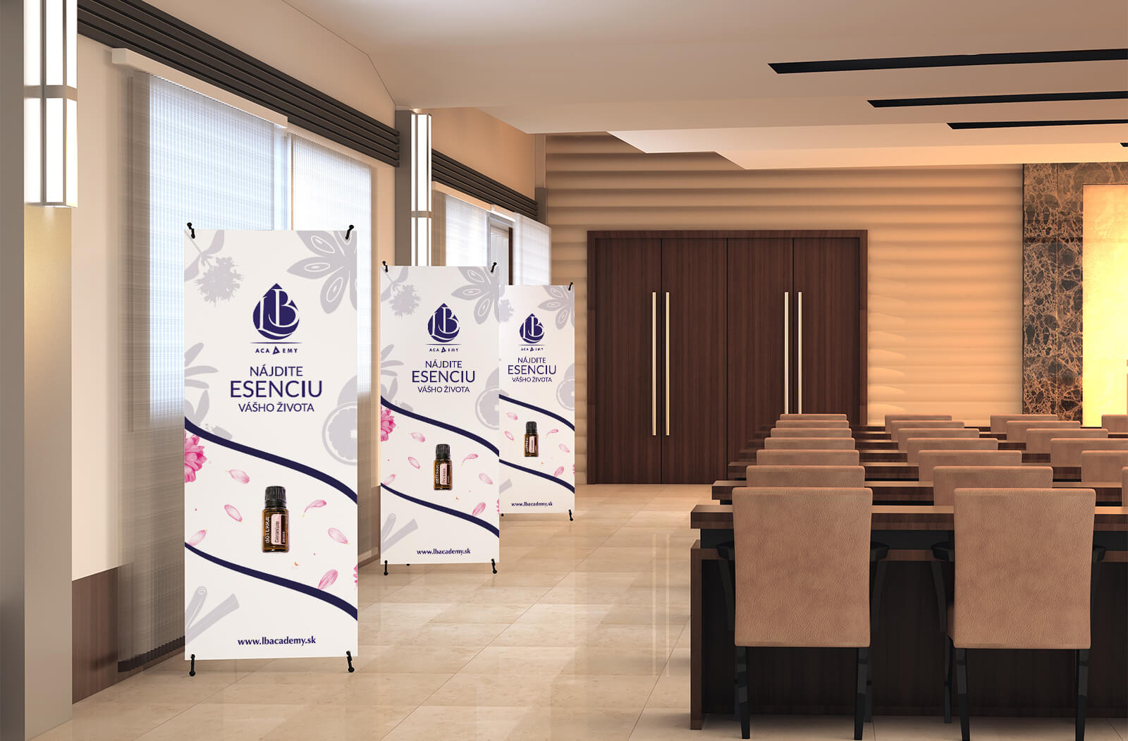
A little less wellness cliché.
Nature was important to the brand. But we didn’t want the identity to become another collection of green leaves on a beige background.
More elevated.
More academic.
More ambitious.
So we paired nature-inspired imagery with purple, gold and white to create something that could feel connected to the natural world without losing its premium character.
Natural doesn’t have to mean rustic.
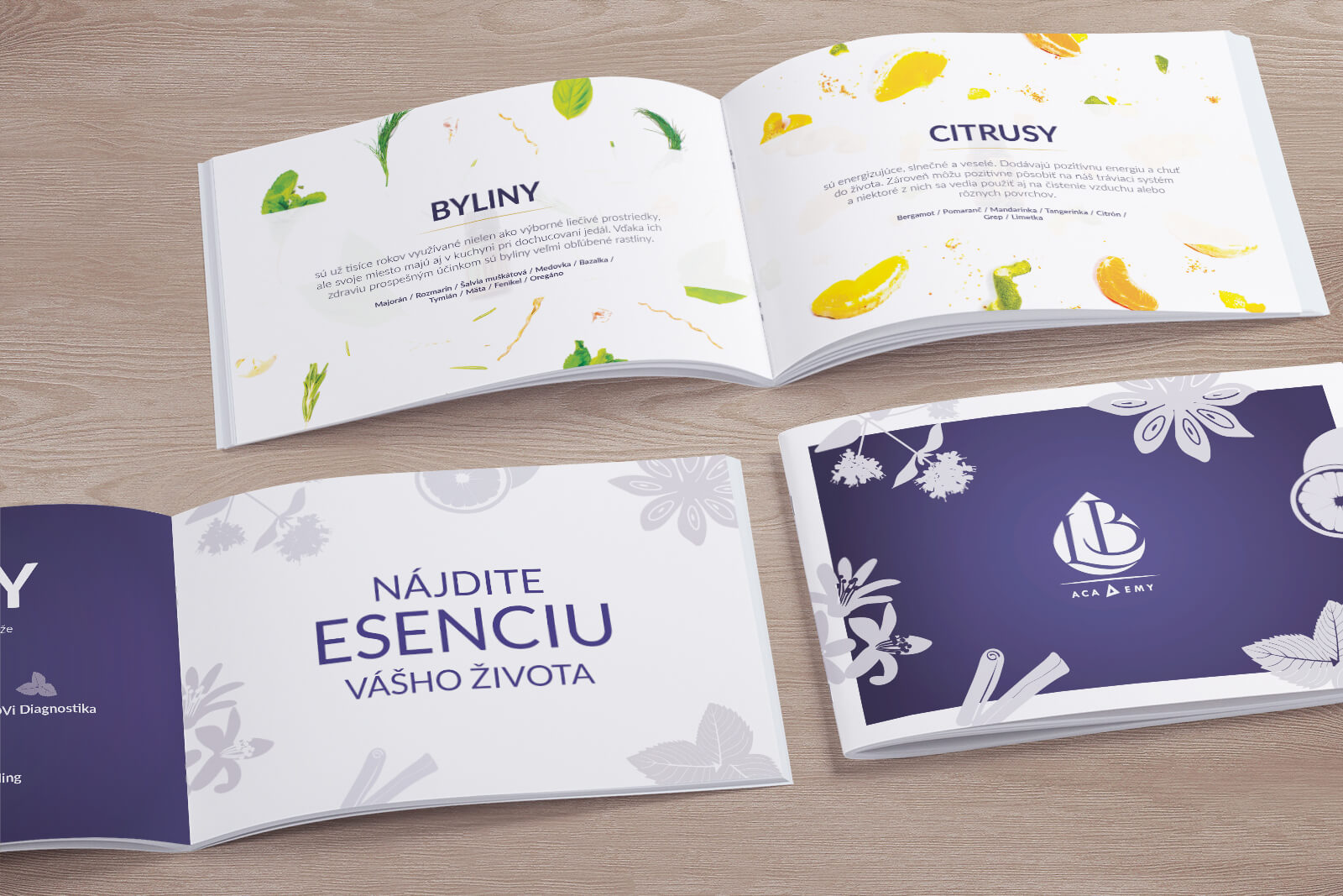
Nature, but dressed up.
Nature graphics became an important part of the wider visual language.
Botanical forms and organic imagery soften the more structured logo and bring the essential-oil side of LB Academy into the identity.
structured + organic
knowledge + nature
mind + senses
balance + growth
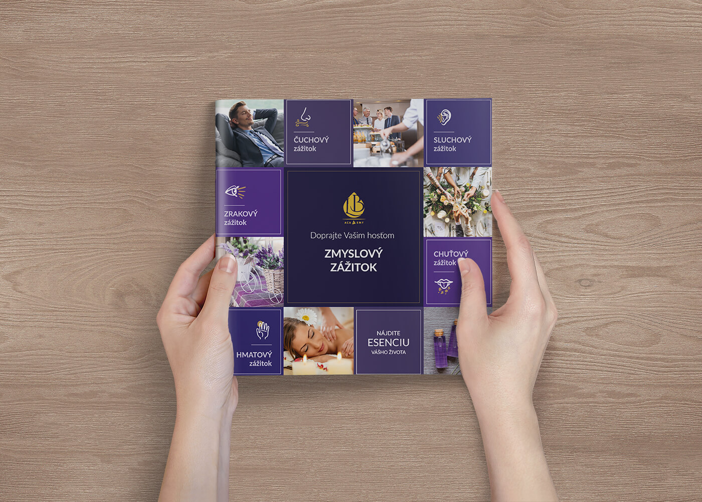
More academy. Less oil shop.
LB Academy wasn’t simply selling bottles of essential oil. Education and mentoring were an important part of what it wanted to represent.
That meant the identity needed enough elegance and structure to feel like an academy, not simply another wellness product brand.
The restrained typography, symmetrical mark and premium palette helped create that distinction, while the nature-inspired graphics kept the identity connected to its origins.
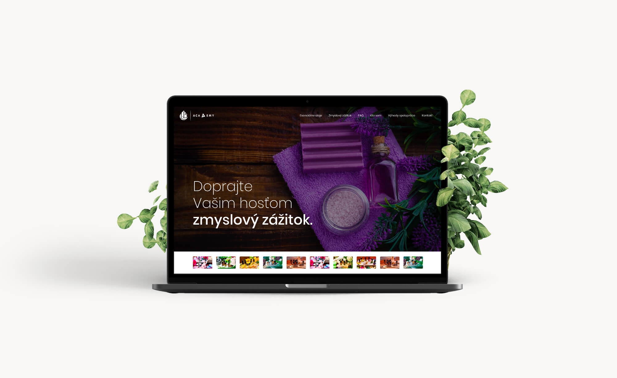
What we worked on.
Rebrand
Giving LB Academy a more distinctive and premium identity built around its central philosophy of Life Balance.
Logo
Combining the visual language of balance scales with the shape of an essential-oil drop.
Visual identity
Creating a sophisticated system around purple, gold and white.
Nature graphics
Bringing an organic layer into the identity without losing its more academic and premium character.
Life. Nature. Balance.
LB Academy brought communication, personal development and essential oils into one approach.
We brought those ideas into one identity.
LB ACADEMY · REBRAND & VISUAL IDENTITY BY WISITLike what you see?