

Your doctor doesn’t need another phone call.

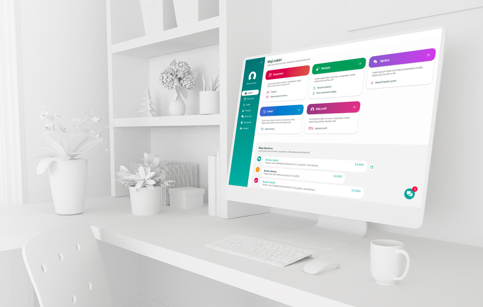
Moji Lekári is a digital patient-doctor portal that moves everyday healthcare requests online from booking an appointment and requesting a prescription to sending a message to your doctor.
For patients, it means less calling. For doctors, fewer interruptions.
Calling your doctor shouldn’t be part of the treatment.
You need an appointment.
You call.
Busy.
You call again.
Still busy.
You finally get through but the doctor or nurse had to stop whatever they were doing to answer.
Now multiply that by an entire waiting room. Every day.
Moji Lekári was created to move the everyday things that don’t need a phone call somewhere better.
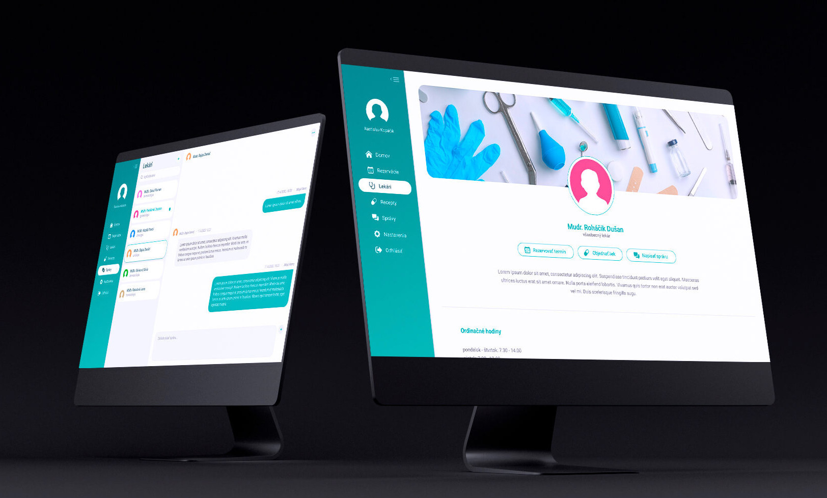
Find your doctor. Choose a time. Done.
For patients, the experience needed to feel straightforward.
Sign in.
Find your doctor.
See available appointments.
Choose what works for you.
Book it.
No repeatedly calling the clinic just to ask whether Tuesday afternoon is available.
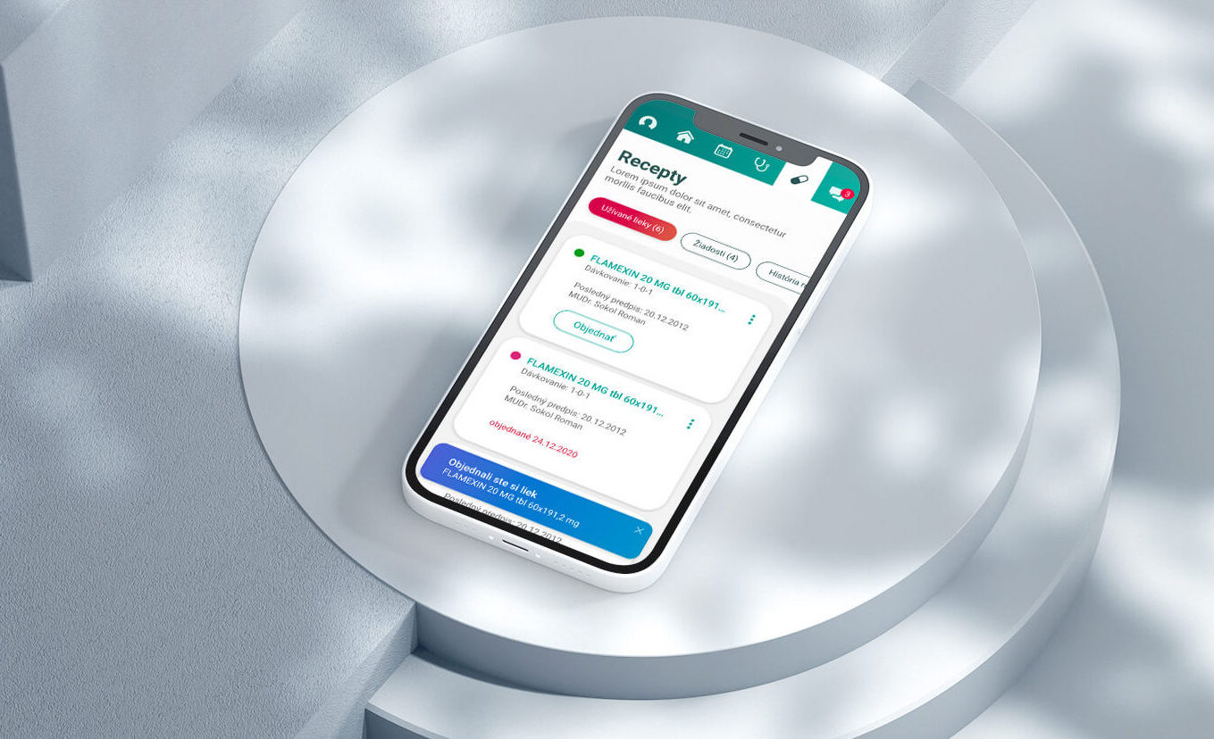
And appointments are only one part of it. Patients can also request repeat prescriptions, ask for medical documents and communicate with their healthcare provider online.
The things you used to call about now have somewhere to go.
The patient gets a portal. The doctor doesn’t get another system.
This is where Moji Lekári becomes more interesting.
A new digital service isn’t particularly helpful to a busy doctor if it also means:
another application,
another inbox,
another login,
another thing to keep open all day.
Moji Lekári is designed to integrate with the outpatient software already used in the clinic.
Patient requests can become part of the doctor’s existing digital workflow rather than creating a completely separate one.
Digitalization without another layer of chaos.
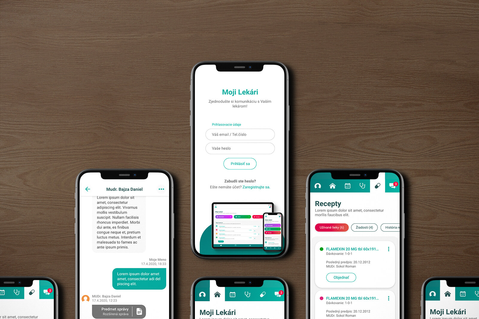
Please don’t call. Message us.
One part of the product we particularly enjoyed working on was the chat experience.
Sometimes you don’t need an appointment. You just need to ask something. And that doesn’t necessarily need to become a phone call either.
Secure messaging gives patients a direct digital channel to their healthcare provider while allowing the clinic to handle communication within its workflow rather than responding to interruptions as they happen.
For the patient, it feels familiar.
For the clinic, it’s manageable.
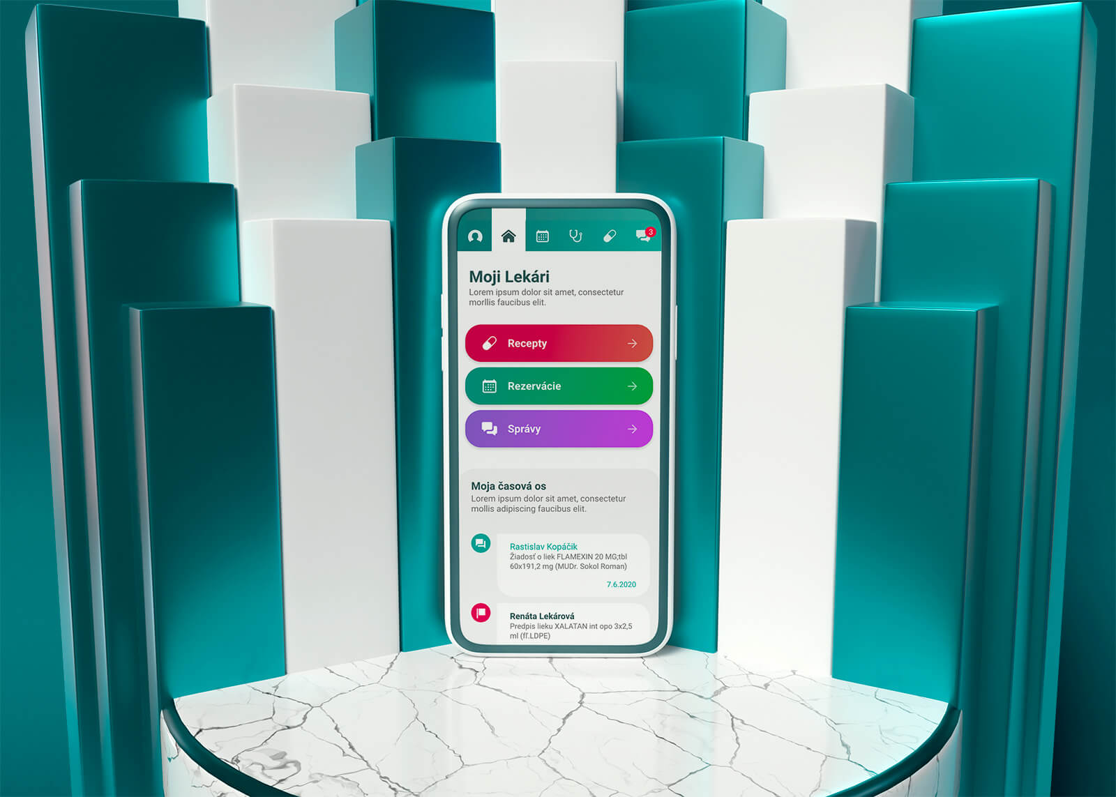
Some things don’t need a visit at all.
A prescription you've had before.
A document you need from the clinic.
A straightforward request.
Traditionally, even small pieces of healthcare administration can mean calling or physically visiting a clinic.
Moji Lekári creates a digital path for those requests too.
The goal isn’t to replace the doctor.
It’s to remove the unnecessary steps between you and them.
Two sides. One experience.
Designing Moji Lekári meant thinking about two very different users.
Wants to get something done.
Quickly. Clearly. Without needing to understand how the clinic works behind the scenes.
Already has patients to treat.
And an established workflow. The new digital channel needs to help manage communication, not create more of it.
The UX needed to connect those two sides without making either responsible for the complexity between them.
Healthcare is complicated enough.
There is a lot happening behind a seemingly simple appointment request.
The interface didn’t need to look as complicated as the system behind it.
We kept the visual language calm, clean and intentionally simple, using teal and white to create an environment that feels modern and appropriate for healthcare without overwhelming the person using it.
Complex system. Calm interface.
What we worked on.
UX
Structuring the patient experience around common healthcare needs without exposing the complexity happening behind them.
Appointment booking
Making finding a doctor and choosing an available appointment straightforward.
Patient requests
Designing flows for prescriptions, documents and other everyday requests that previously often required a phone call or visit.
Chat
Creating a familiar messaging experience for communication between patients and healthcare providers.
Doctor-patient experience
Connecting a simple patient-facing portal with the workflows happening on the clinic side.
UI design
Building a calm, modern interface around teal, white and a clear information hierarchy.
Less time calling. More time treating.
Moji Lekári gives patients a simpler way to reach their healthcare providers without giving doctors another disconnected system to manage.
Sometimes better healthcare UX isn’t about adding more.
It’s about removing the unnecessary parts.
MOJI LEKÁRI · UX/UI BY WISITLike what you see?