

Simple for students. Anything but simple behind the scenes.

At the end of the semester, hundreds of students need to check out of their dorm rooms.
What used to mean paperwork, queues and a lot of manual coordination became a digital system where students simply choose when they’re available.
The complicated part? Making everything else work around that choice.
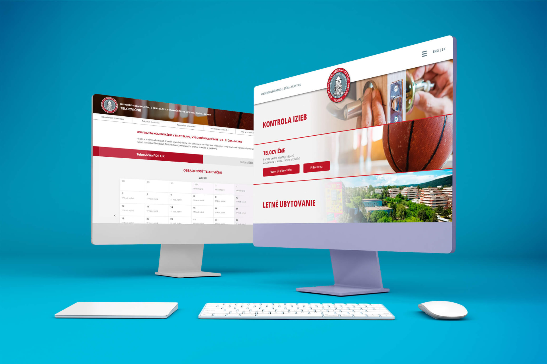
Checking out shouldn’t take all day.
The original process was manual.
Students needed to leave. Staff needed to inspect their rooms. Everyone needed to know when and where to be.
Multiply that by an entire dorm and you get:
Queues.
Paperwork.
Waiting.
Confusion.
And a considerable amount of coordination for the people running the dorm.
So we built a system to organize it.
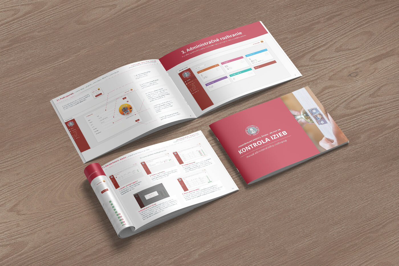
Pick a time. We’ll handle the rest.
For students, we wanted the experience to be extremely simple.
Choose a date.
Choose an available time interval.
Done.
The system then confirms exactly when the inspection will take place, so the student knows when to be in their room.
No standing in line. No wondering when someone will arrive. No trying to coordinate the process manually.
The student sees the easy part.
Now for the complicated part.
Choosing a time slot is easy.
Organizing what happens after hundreds of students choose theirs isn’t.
Behind that simple booking interface is a system for creating and managing check-out dates, capacities and time intervals, and coordinating the staff members who actually have to visit all those rooms.
And those rooms aren’t conveniently arranged in the order people booked them.
So we had another problem to solve.
Don’t send them from one end of the dorm to the other.
Imagine a staff member has ten rooms to inspect during one time interval.
Room 214.
Then 817.
Then 219.
Then 602.
Technically, the schedule works. Practically, it’s terrible.
So the system doesn’t simply create a list of rooms.
It calculates the ideal journey between them.
For every time interval, the system organizes inspections into a more efficient route so staff aren’t constantly walking back and forth between distant parts of the dorm.
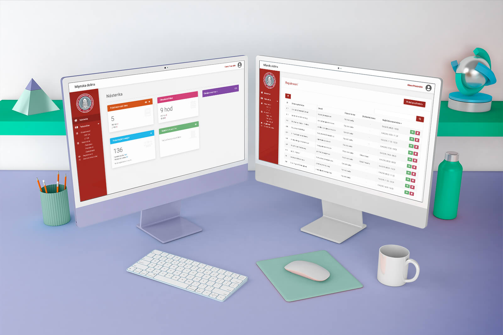
A schedule became a route.
This became one of the most important pieces of logic behind the whole product.
The system has to take individual student bookings and turn them into something that makes sense as a physical journey through a building.
Different floors.
Different rooms.
Different availability.
Different time intervals.
One efficient route.
Less walking. Less waiting. Less chaos.
And then COVID made it harder.
The system was created during a period when organizing large groups of students came with an additional constraint:
Don’t organize large groups of students.
The check-out flow had to account for distancing and reduce situations where students would gather or cross paths unnecessarily.
That influenced how time slots, capacity and the overall flow were designed.
What had previously been an inconvenient administrative process had suddenly also become a question of managing how people physically moved through the space.
So we designed for that too.
Complexity belongs behind the screen.
Students.
Rooms.
Dates.
Time intervals.
Availability.
Capacity.
Staff.
Routes.
Physical distance.
And scheduling logic connecting all of it.
But none of that should become the student’s problem.
For them, the experience still needed to be:
When can you be there?
Choose.
Confirm.
Done.
That’s what good UX sometimes looks like.
A complicated system that doesn’t feel complicated to the person using it.
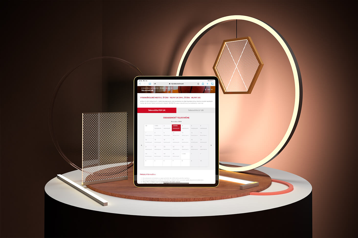
Built. Tested. Used.
This wasn’t a concept designed for a portfolio.
We designed the UX and UI, developed the system and tested it with the people who would actually use it.
Then students started checking out with it.
The complexity stays behind the scenes.
Which is exactly where we wanted it.
What we worked on.
UX
Turning a complicated administrative process into a simple booking experience for students and a manageable workflow for dorm staff.
Scheduling logic
Structuring dates, time intervals and availability around the real-world requirements of dorm check-outs.
Ideal journey
Designing the logic that automatically turns room inspections into efficient routes through the dorm.
UI design
Keeping the student-facing experience straightforward despite the complexity underneath it.
Development
Building the complete working system rather than stopping at the interface.
Testing
Testing the product with real users and refining the flow before putting it into use.
You pick the time. We figure out the rest.
Sometimes the best indication that a complicated system works is that the person using it never has to know how complicated it was.
DORM CHECK-OUT SYSTEM · UX/UI & DEVELOPMENT BY WISITLike what you see?