

A whole universe of data. Make sense of it.

DataVersum was a concept for a data management company designed for organizations dealing with large amounts of information.
Because having data is one thing. Understanding what you have is another.

When data becomes a universe.
Big companies don’t usually have a data problem because they don’t have enough of it.
Quite the opposite.
The more a company grows, the more information it creates, collects and stores.
And eventually, that data can start to feel like its own universe.
Huge.
Complex.
And not particularly useful if you can't navigate it.
DataVersum was imagined as a company that could help businesses bring that universe under control.
DATA + UNIVERSUM
The name came directly from the idea behind the company.
Data. And an entire universum of it.
DataVersum.
A name for a company built around navigating, organizing and understanding large amounts of information.
D meets V.
We wanted the identity to feel appropriate for a serious technology company without falling into the usual world of complicated data graphics.
So we kept it simple.
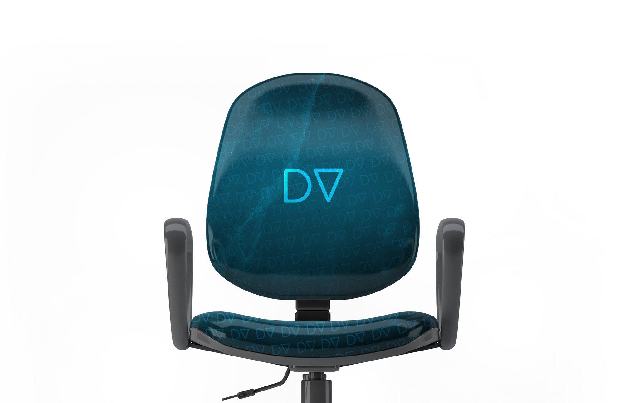
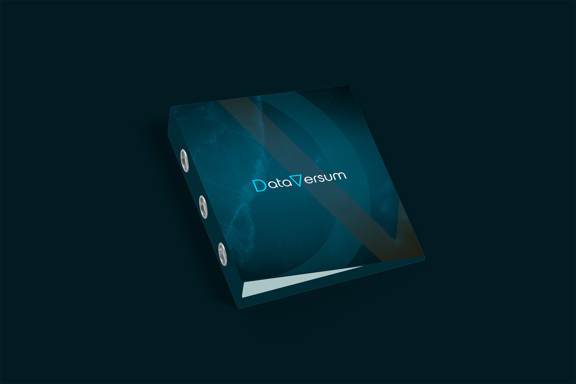
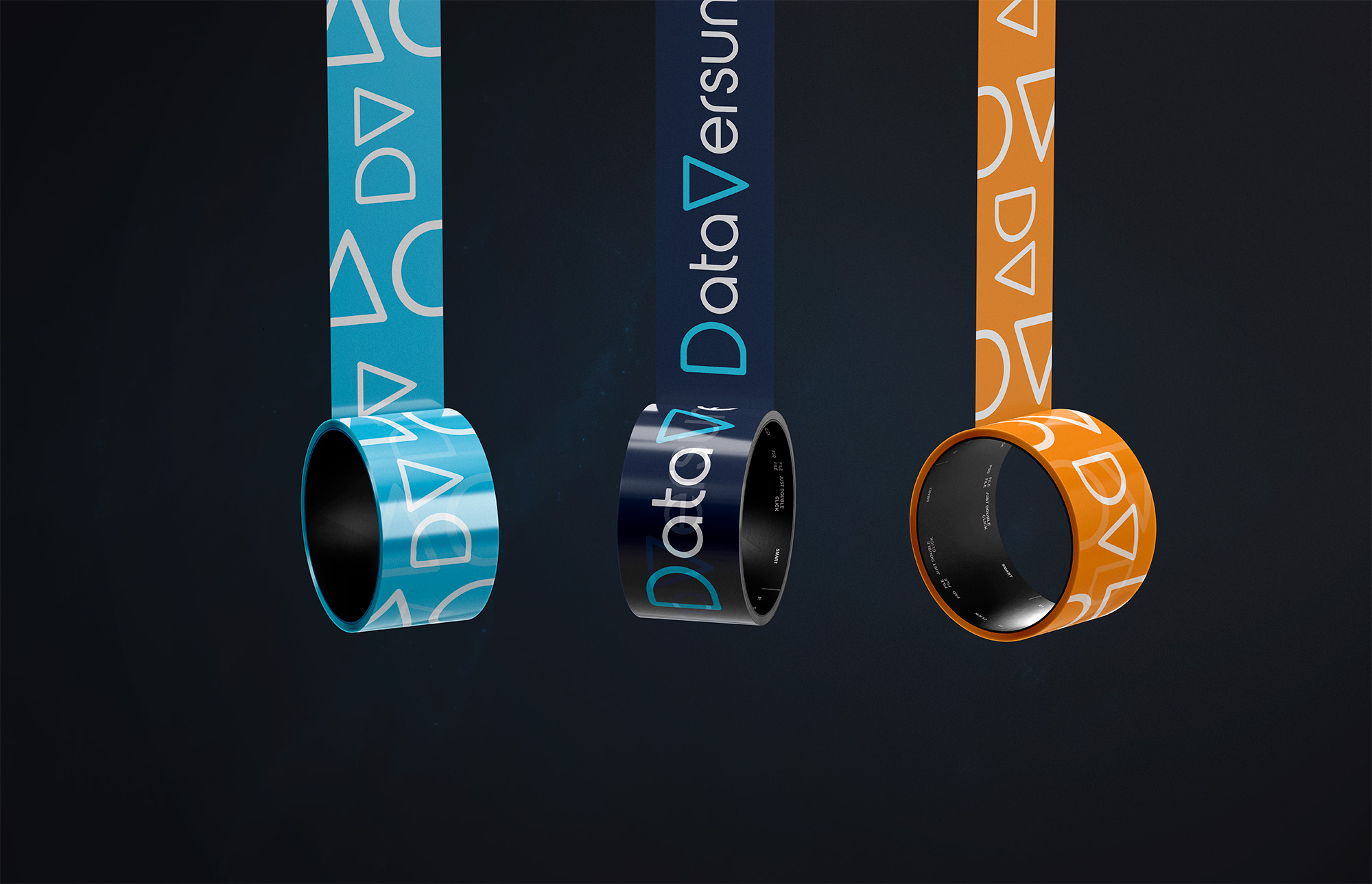
The D in Data and V in Versum became the recognizable elements of the wordmark.
Reduced to simple geometric shapes, the letters could be highlighted, separated and played with across the identity.
Two letters became the building blocks of the brand.
Data doesn’t need more visual noise.
A company dealing with complex information doesn’t necessarily need a complex identity.
Actually, we liked the opposite.
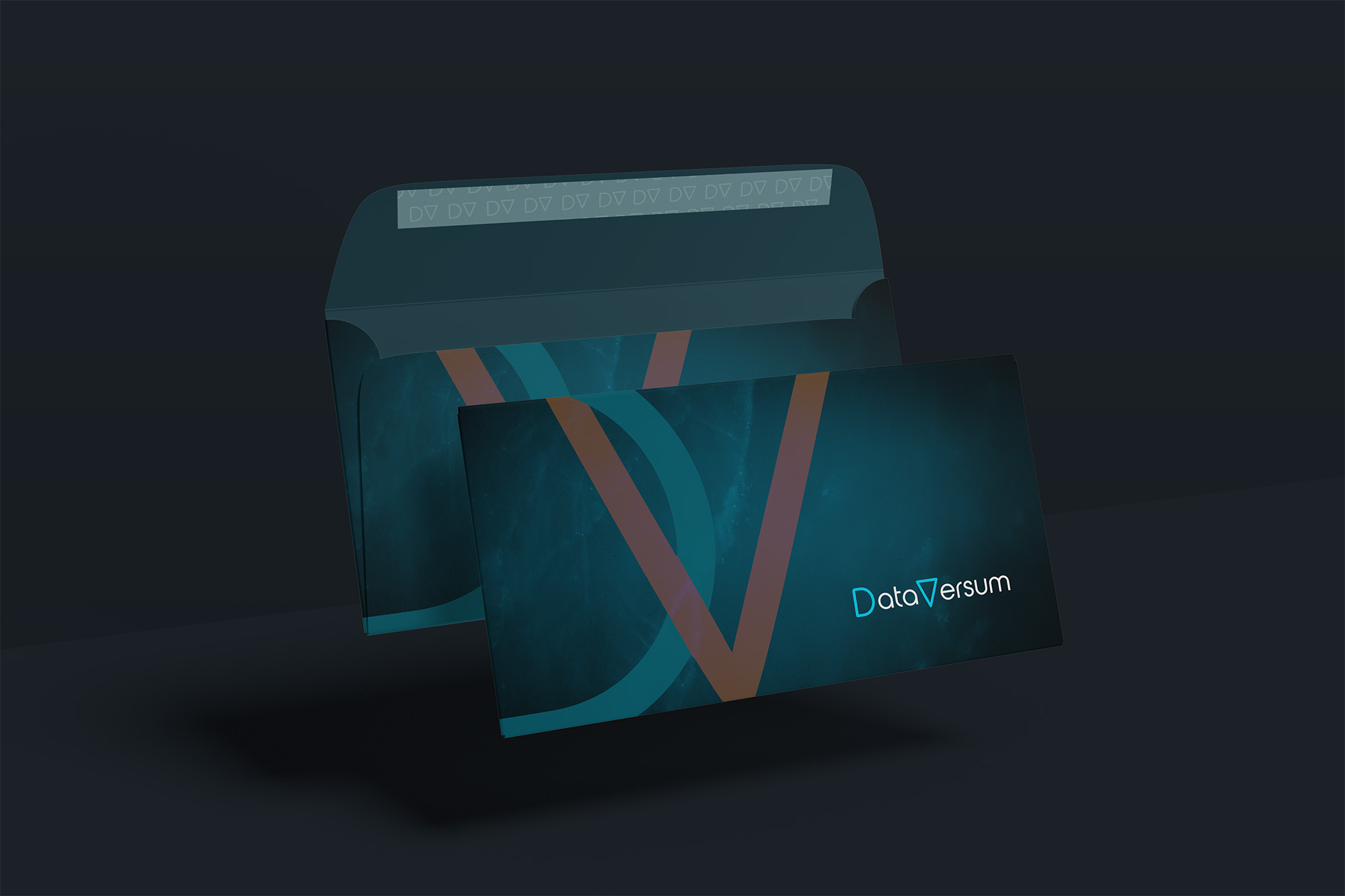
Simple typography.
Simple geometry.
Plenty of space.
A visual system that feels technical and intelligent without trying too hard to look technological.
Because there was already enough complexity in the thing DataVersum was supposed to deal with.
The brand didn’t need to add more.
Serious. Not boring.
The challenge was finding the space between two extremes.
Too playful, and a company trusting DataVersum with large amounts of business information might struggle to take it seriously.
Too corporate, and it would disappear into a sea of interchangeable technology brands.
The D and V gave us just enough to play with.
A small visual idea inside an otherwise clean, premium identity.
What we worked on.
Naming
Creating DataVersum from the idea of an entire universe of business data waiting to be understood.
Logo
Building a typographic mark around the D and V hidden inside the name.
Visual identity
Turning those two simple letterforms into a minimal visual system designed to feel technical, intelligent and premium.
Find your way through the data.
DataVersum started with the idea that having more information doesn’t automatically mean knowing more.
Sometimes you just need a better way through it.
DATAVERSUM · NAMING & VISUAL IDENTITY BY WISITLike what you see?