
Behind every clinic, there’s a system keeping things moving.

Medicom develops medical software used by healthcare professionals across Slovakia.
With roots going back to 1993, its systems sit behind the everyday work of outpatient clinics. From patient records and prescriptions to laboratory results and connections with national eHealth services.
Our task was to explore what that experience could look like today.
There’s a lot happening behind your doctor.
You walk into a clinic.
Your doctor opens your record.
Checks your history.
Prescribes medication.
Records the examination.
Reviews laboratory results.
Handles a sick leave.
And somewhere behind all of those seemingly ordinary actions, different systems need to communicate with each other.
Medicom builds the software that keeps much of that work together.
The patient sees the doctor.
The doctor sees Medicom.
Built for the people keeping healthcare running.
Medicom isn’t consumer health technology.
It’s professional software for doctors and healthcare organizations.
Its tools help clinics manage medical records and administration while connecting their everyday work with laboratories, hardware and Slovakia’s wider digital healthcare infrastructure.
That gave us an important direction for the rebrand.
It didn't need to look fashionable.
It needed to look dependable.
Connected to healthcare.
One of the most important roles Medicom plays is connecting outpatient clinics with Slovakia’s national digital healthcare infrastructure.
Electronic prescriptions.
Electronic sick leave.
Examinations.
Laboratory information.
Patient records.
Different pieces of healthcare need to move between different systems reliably.
Medicom sits in the middle of much of that complexity.
This is technology healthcare professionals can rely on.
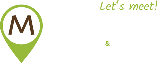
People inside the M.
For the redesigned logo, we kept the idea deliberately simple.
Inside the M of Medicom are two people reaching towards each other.
A small human element inside a company built around highly technical systems.
Because underneath all the integrations, records and medical administration, the technology still exists to connect people:
Doctors.
Patients.
Healthcare professionals.
Technology in the middle. People at both ends.
Medical without the clichés.
Cross.
Heartbeat.
Stethoscope.
Doctor smiling at camera.
Repeat.
We didn’t think Medicom needed any of it.
The company’s credibility comes from what it actually does and how long it has been doing it.
So we kept the visual identity restrained.
Dark blue. Strong typography. Simple graphics. Clear information.
How do you show invisible infrastructure?
That became one of the more interesting parts of designing the website.
Medicom’s work is complex.
And much of what makes its technology valuable isn’t something you can photograph.
Integrations.
Data movement.
Connections.
Digital processes.
Systems talking to systems.
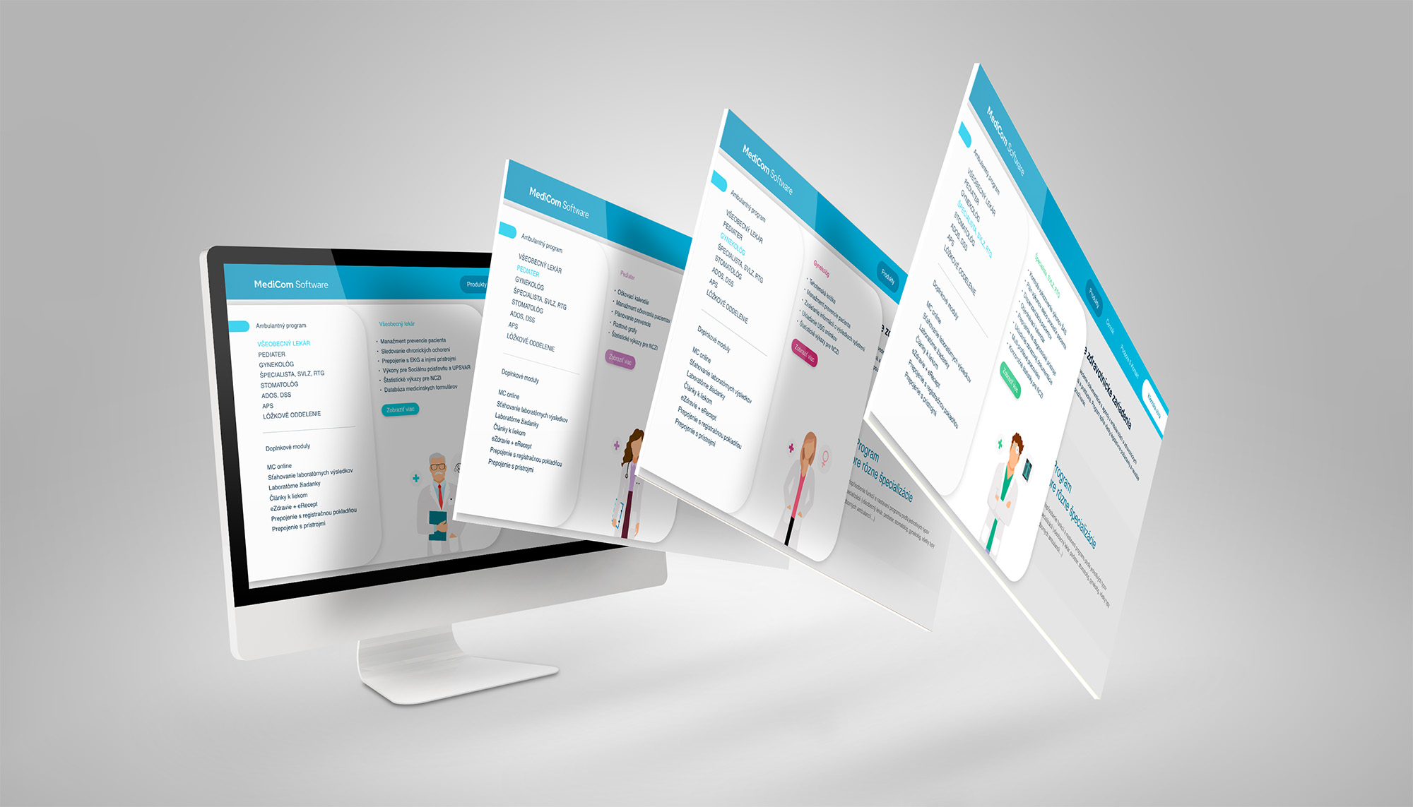
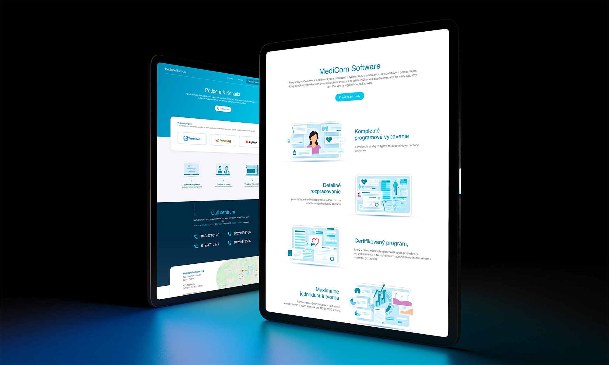
So we developed a graphic language for the website that could make those ideas visible without turning every page into a technical diagram.
Explain the complexity. Don’t recreate it.
Complex underneath. Clear on top.
A company like Medicom has a lot to explain.
Different products.
Different healthcare workflows.
Different integrations.
Different types of users.
Years of expertise behind all of them.
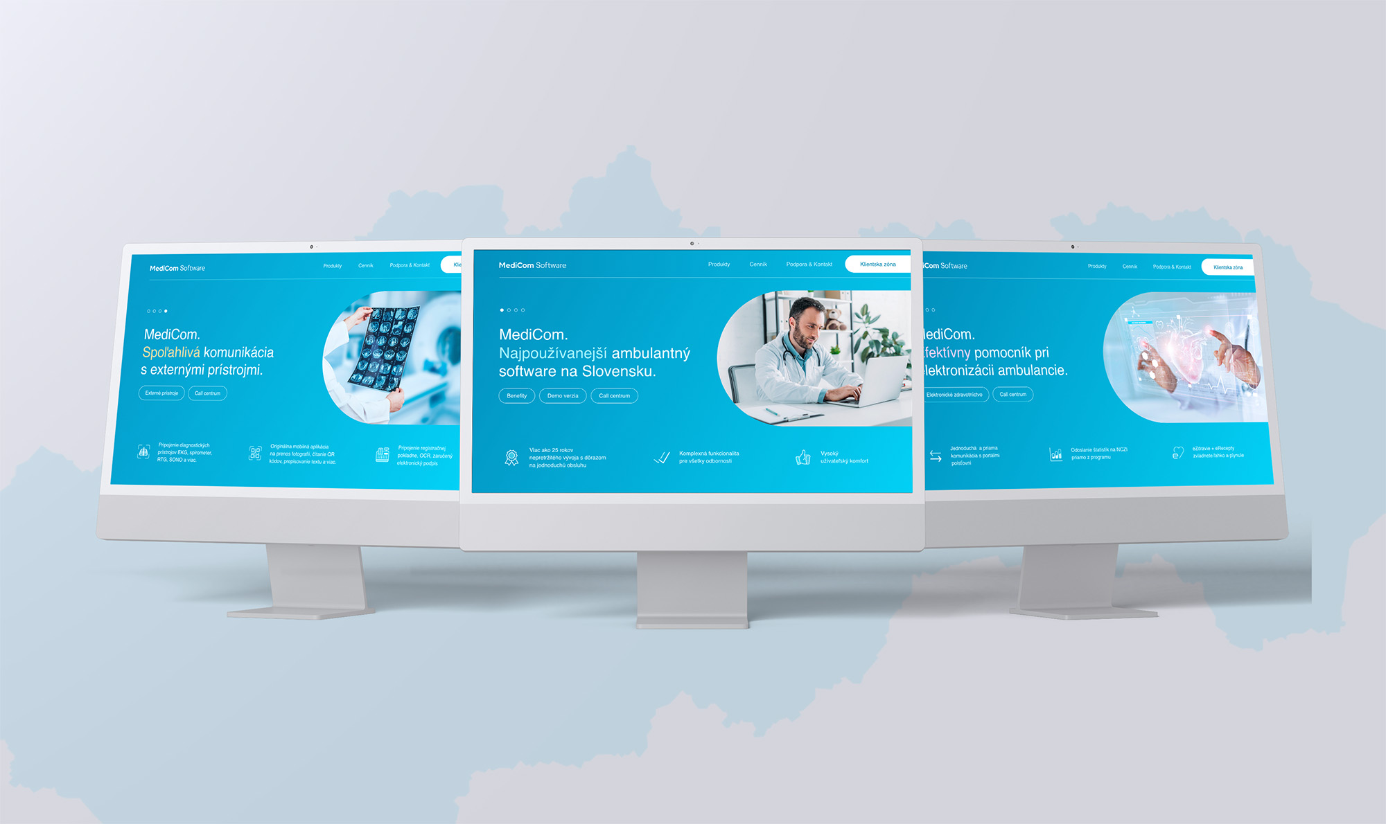
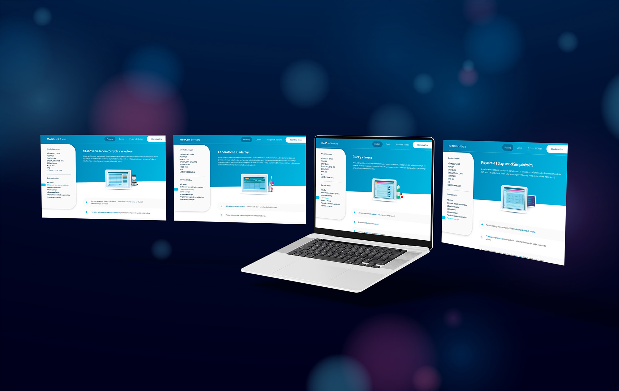
The website needed to organize that information without making visitors work to understand what the company actually provides.
The visual direction therefore became intentionally calm and structured.
Because when the product itself handles complexity—
the brand doesn’t need to create more of it.
Experience doesn’t have to look old.
Medicom’s history is an advantage.
It represents decades spent building software for a very specific healthcare environment and understanding what doctors actually need from it.
The rebrand wasn’t about making that history disappear behind something shiny and new.
It was about giving the company a visual presence that could better represent what it had already become:
established, specialized and still moving forward.
What we worked on.
Rebrand concept
Exploring a more contemporary identity for an established Slovak medical-software company.
Logo redesign
Creating a simple M symbol built around two people and the connection technology enables between them.
Visual direction
Using dark blue, typography and restrained graphics to create a professional, premium and technology-focused identity.
Website design
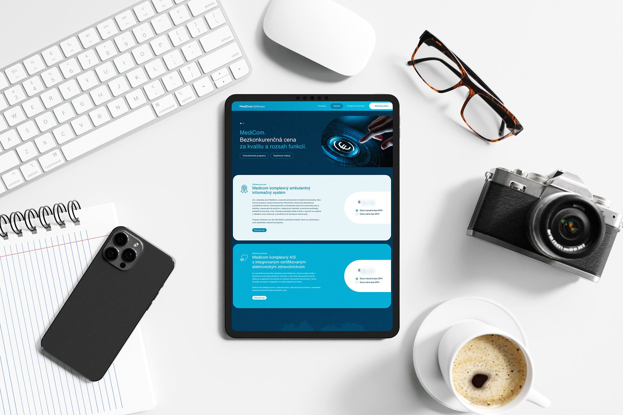
Restructuring Medicom's digital presence around clearer communication of its products and expertise.
Website graphics
Creating visuals that could explain abstract ideas such as integrations, connectivity and healthcare infrastructure without relying on generic medical imagery.
Healthcare is complicated. Looking professional doesn’t have to be.
Medicom has spent decades building technology for the systems behind everyday healthcare. Our rebrand concept explored an identity that could communicate the same qualities its customers need from the software itself.
Professional. Clear. Dependable.
MEDICOM · REBRAND & WEBSITE CONCEPT BY WISITLike what you see?