

One button. When every second

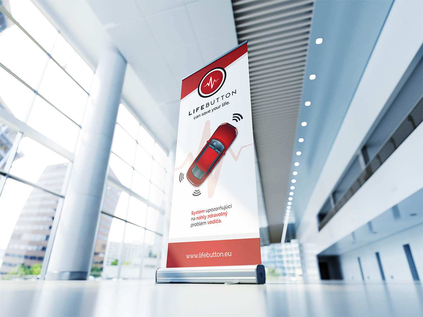
LIFEBUTTON is a driver distress alert system designed for medical emergencies
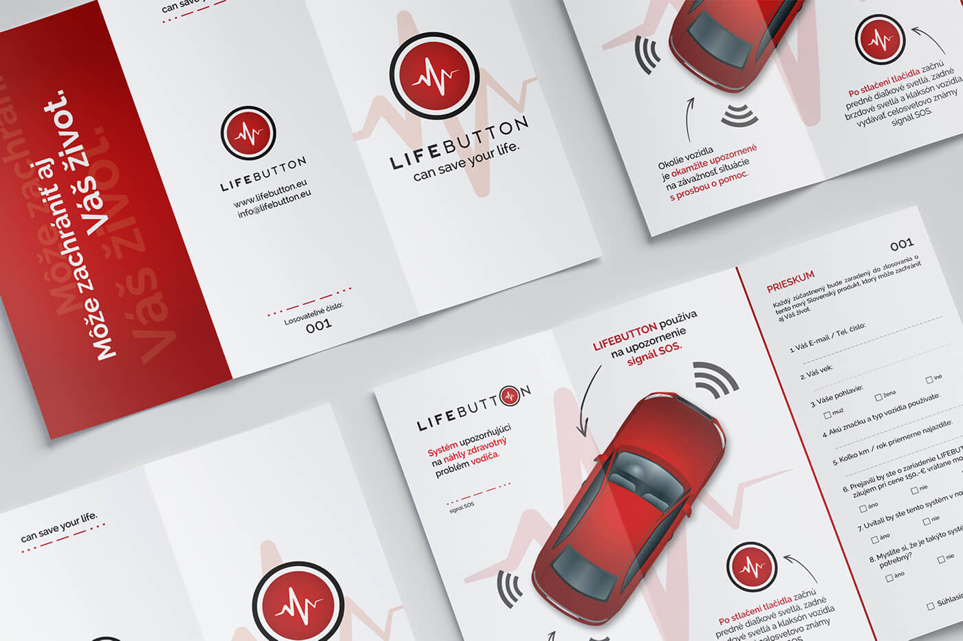
One press activates the car’s lights and horn in an SOS pattern, turning the vehicle itself into a call for help.
Our job was to give that idea an identity
What if the driver can’t call for
The idea behind LIFEBUTTON started with a simple question.
What happens when someone becomes seriously unwell while driving?
A phone might be out of reach.
Vision can disappear.
Movement can become difficult.
Consciousness can be lost within moments.
There may still be time to do one thing:
PRESS.
One action is all the system needs. Once activated, LIFEBUTTON takes over the signaling automatically.
The headlights flash.
The tail lights flash.
The horn sounds.
SOS.
The signal warns other road users that something is wrong while making the vehicle much easier for nearby people to identify.
The driver doesn’t need to explain.
The O is there for a
The product already had the perfect name: LIFEBUTTON. So the new identity didn’t need another complicated metaphor.
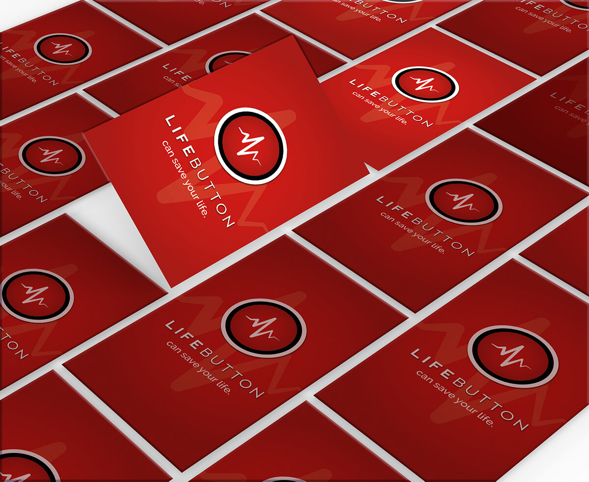
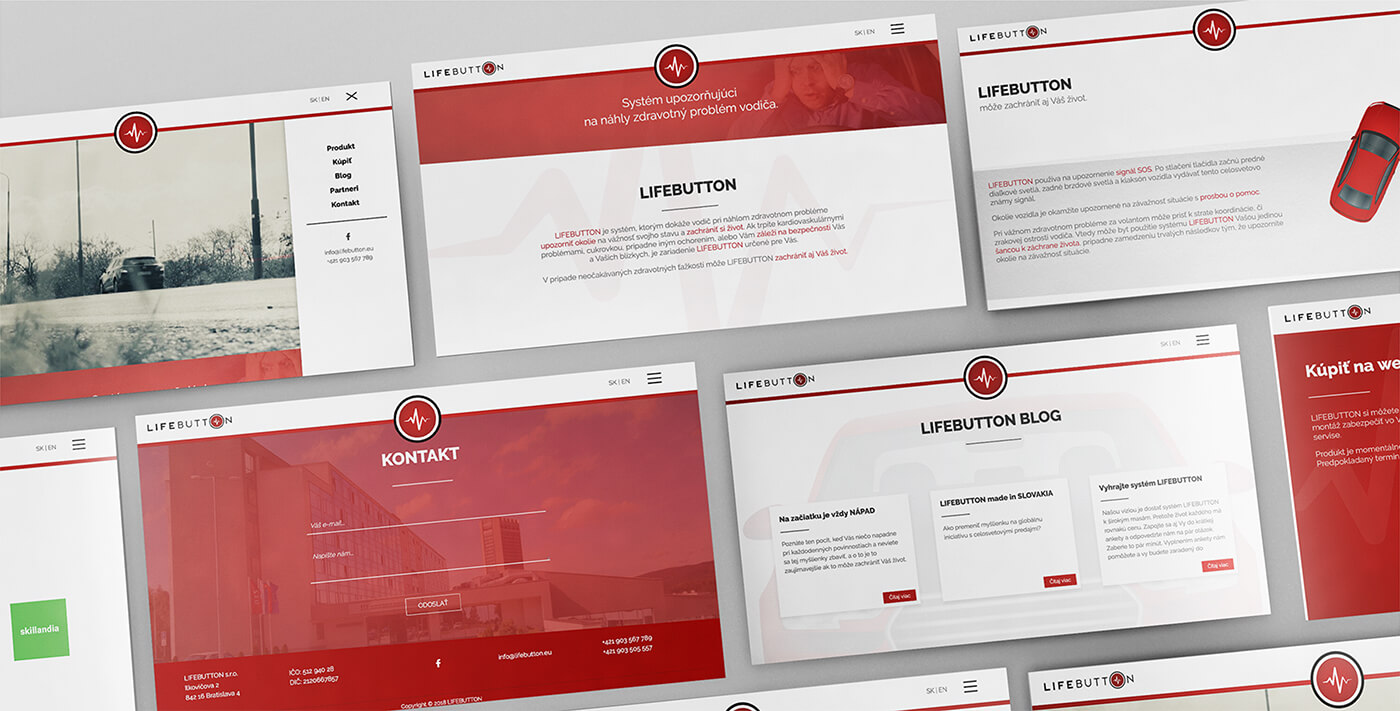
We turned the O into the button itself. A heartbeat symbol inside connects it directly to the reason the product exists: a person’s health and life.
The name. The physical product. Its purpose.
· · · — — — · · ·
The SOS signal wasn’t only part of the technology. It became part of the visual language too.
Dots and dashes gave us a graphic element directly connected to what happens after LIFEBUTTON is pressed.
The system sends SOS.
Designed to look
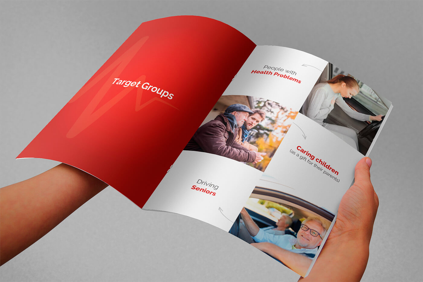
This isn’t a product people should have to decipher.
The identity uses red, black and white to create strong contrast and an immediate sense of alert.
Direct.
Technological.
When seconds matter, making the brand quiet
Help that’s already
LIFEBUTTON doesn’t depend only on reaching someone far away. It asks: Who can help right now?
The people driving behind you.
The person walking nearby.
The vehicle becomes the message.
What we worked
Rebrand
Giving an existing life-safety product a clearer, more immediate visual identity.
Logo
Turning the O in LIFEBUTTON into the physical button itself and connecting it with the heartbeat symbol.
Visual identity
Building a high-contrast system around red, black and white to communicate urgency, technology and safety.
SOS visual language
Taking the Morse code signal used by the product and making its dots and dashes part of the wider identity.
· · · — — — · · ·
Sometimes the message needs to be understood
We gave LIFEBUTTON an identity built around the same signal it was designed to send.
LIFEBUTTON · REBRAND & VISUAL IDENTITY BY WISITLike what you see?