
A shelter can be a happy place too.

Humenské Labky is a Slovak nonprofit helping abandoned dogs — and working to make sure fewer of them need rescuing in the first place.
For their rebrand, we wanted to move away from sadness and put something else at the center.
Love.
Less sad. More hopeful.
Animal shelters deal with difficult things every day.
Abandoned dogs.
Animals needing veterinary care.
Finding foster homes.
Finding permanent homes.
Raising money to make all of it possible.
It’s easy for a shelter brand to build its entire identity around that sadness. We wanted Humenské Labky to feel different.
Because behind every difficult beginning is what the shelter is actually working towards:
A much happier ending.
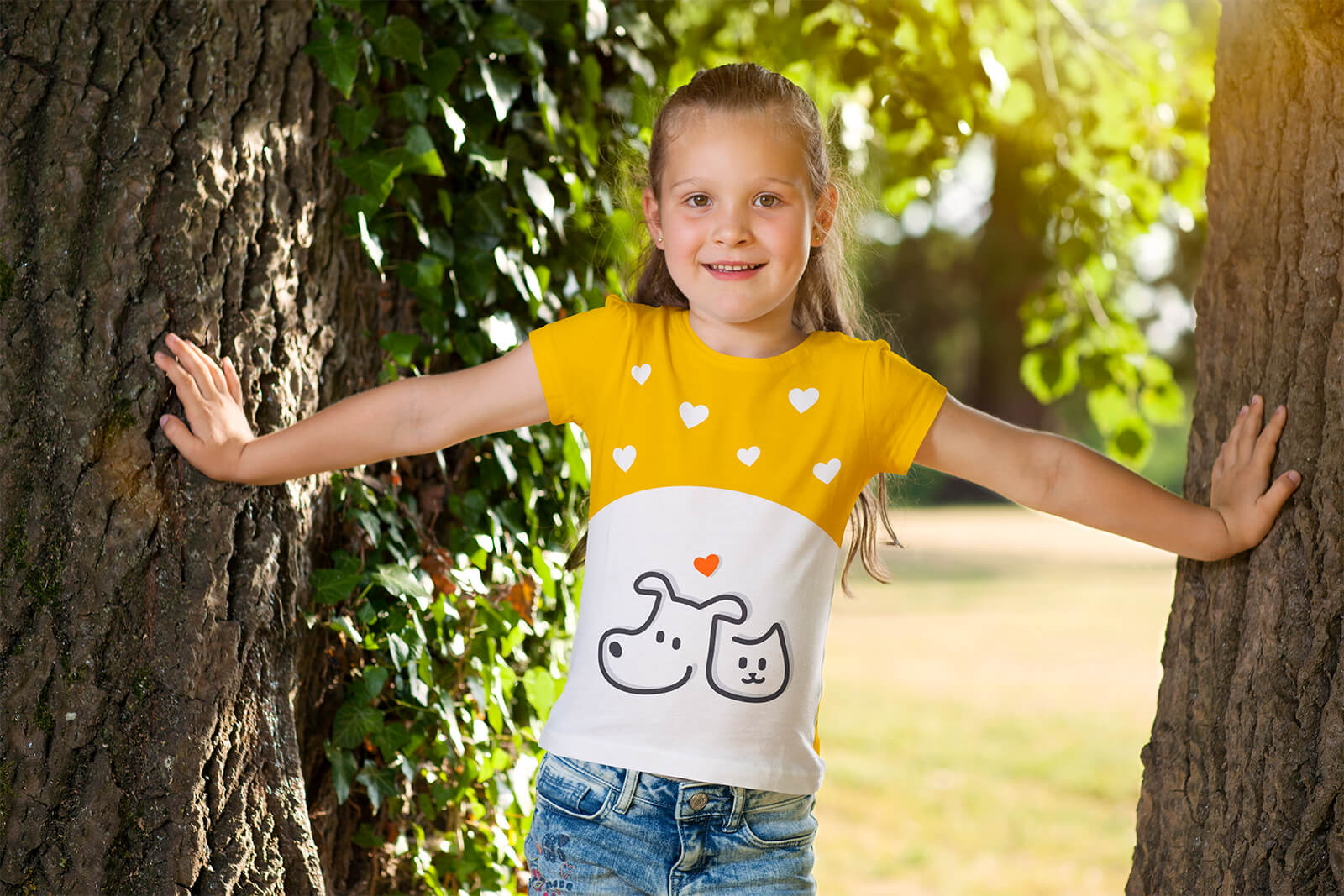
Dog. Cat. Heart.
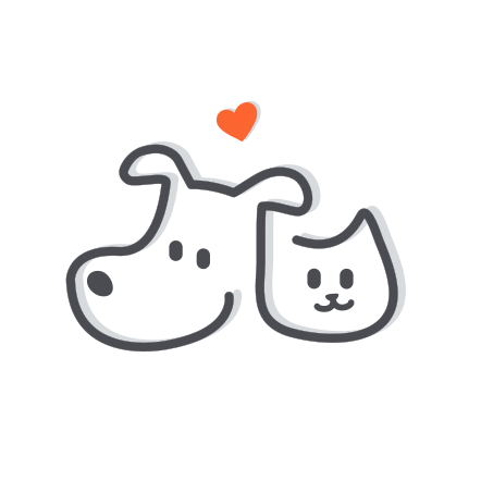
The new logo brings the idea down to three very simple things. A dog. A cat. And love.
The animals are drawn together with one continuous line, meeting in a heart that makes the relationship between them and the people caring for them part of the symbol itself.
Simple enough to recognize instantly.
Cute enough to remember.
Optimistic enough to represent what Humenské Labky is trying to achieve.
🐾 + ♥
Not another sad shelter brand.
We deliberately moved away from building the identity around sad faces and guilt.
Humenské Labky needs people to care. To adopt. Donate. Volunteer. Foster. Help.
But caring doesn’t always have to begin by making someone feel terrible. The new identity focuses on the affection people have for animals — and the good that can happen when they decide to do something with it.
Less guilt. More love.
A happier kind of yellow.
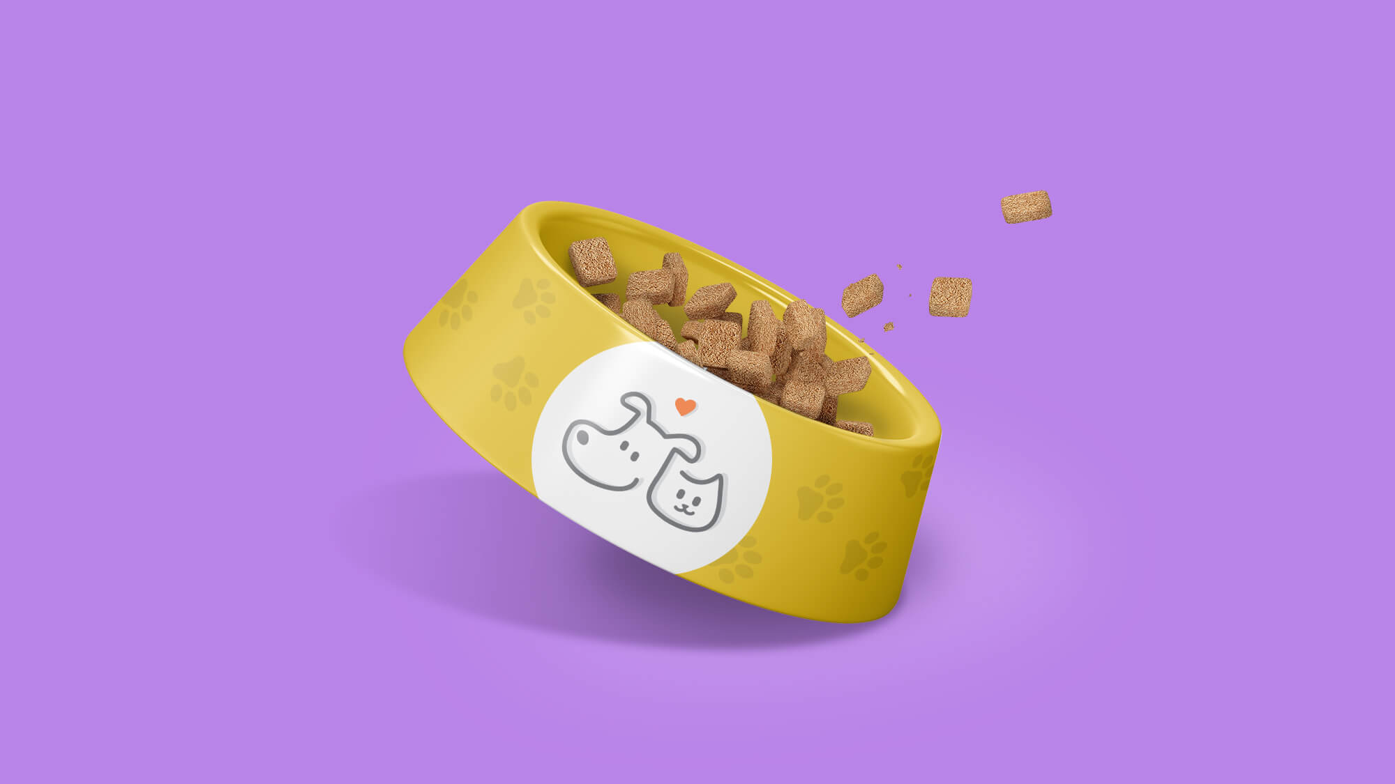
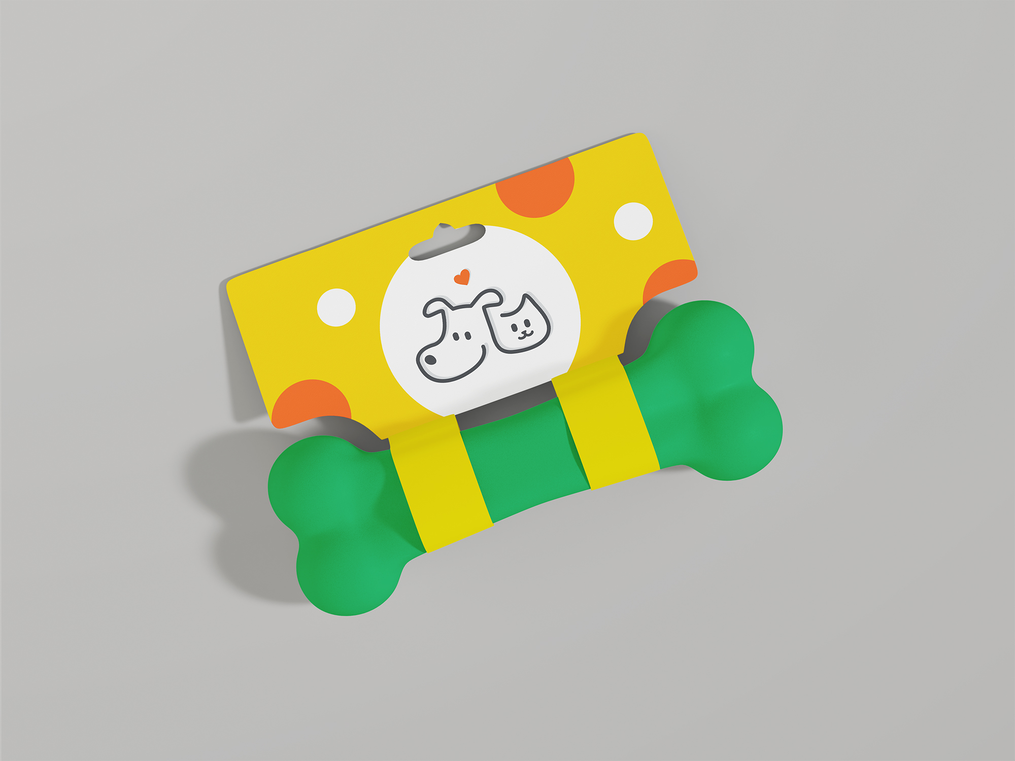
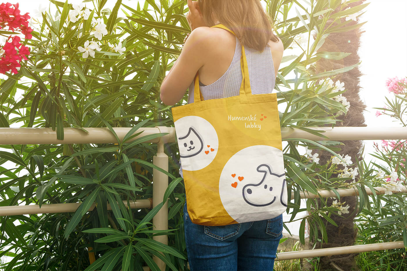
Yellow and orange became the core colors of the new identity. Combined with black and white, they create a simple visual system that works around the shelter itself and across all the different places Humenské Labky needs to communicate.
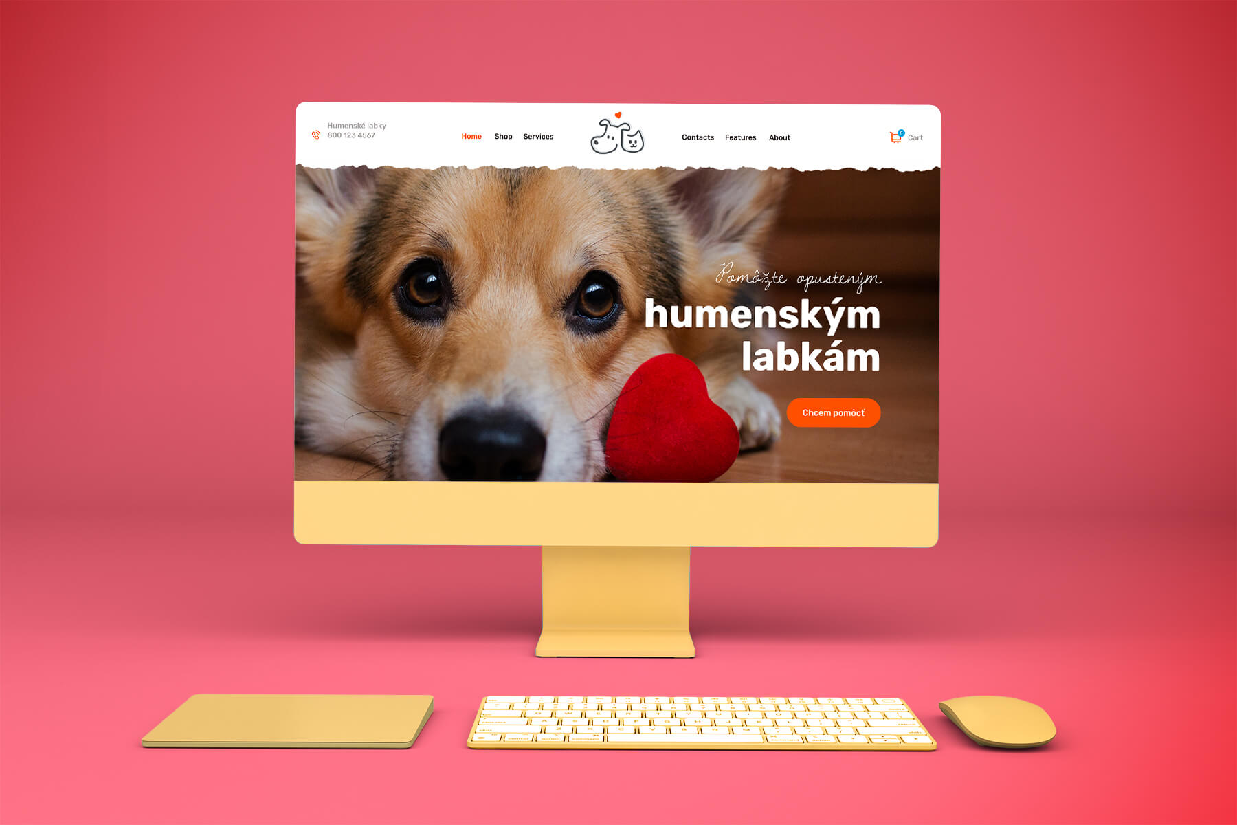
From adoption posts and fundraising to vehicles, merchandise and events. Wherever the shelter goes, the identity can go with it.
Rescue is only part of the job.
Humenské Labky doesn’t only want to rescue more dogs. Ultimately, it wants fewer dogs to need rescuing.
Alongside rescue, adoption and veterinary care, the organization works on education, fostering and broader improvements in animal welfare.
Their philosophy is about dealing with what happens after an animal is abandoned while also working on the reasons it happens in the first place.
The identity needed enough warmth to represent the animals
and enough credibility to represent
the organization behind them.
What we worked on.
Rebrand
Moving Humenské Labky away from a basic shelter identity towards something warmer, simpler and much more memorable.
Logo
Connecting a dog, cat and heart in one continuous symbol built around affection for animals.
Visual identity
Creating an optimistic system around yellow, orange, black and white that could work everywhere from social media to the shelter itself.
Brand applications
Giving the organization an identity flexible enough for adoption communication, fundraising, merchandise, vehicles, events and everyday shelter life.
Some stories deserve a happier ending.
Humenské Labky spends every day helping animals get closer to one. We created an identity that feels like it.
HUMENSKÉ LABKY · REBRAND & VISUAL IDENTITY BY WISITLike what you see?