


Where ideas leave the university and enter the real world.

InQb is the University Technology Incubator helping students, graduates and researchers turn technological ideas into viable businesses.
Ideas might start in a classroom or lab.
They don’t have to stay there.

From university idea to real company.
Universities are full of clever people working on clever things.
But a great technical idea and a viable business are two very different things.
InQb exists in the space between them.
Through business education, mentoring, workspace and technical resources, it gives students and researchers an environment where an idea can be tested, developed and eventually taken beyond the university.
A place where technology gets the chance to become something more.
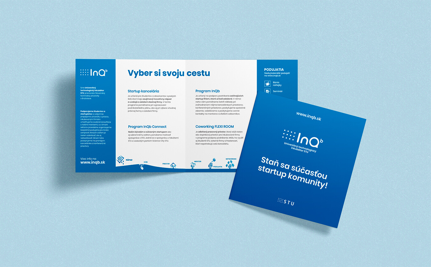
The university connection mattered.
This was a rebrand, but inQb couldn’t simply become an entirely independent-looking technology brand.
It’s part of the Slovak University of Technology, and that relationship matters.
So instead of trying to hide its academic roots, we looked for a way to keep them while giving inQb a much more contemporary identity of its own.
Elements of the university’s visual language remained.
The familiar light blue remained.
The dots remained.
But what happened around them changed.
Connected to the university. Ready for what comes after it.
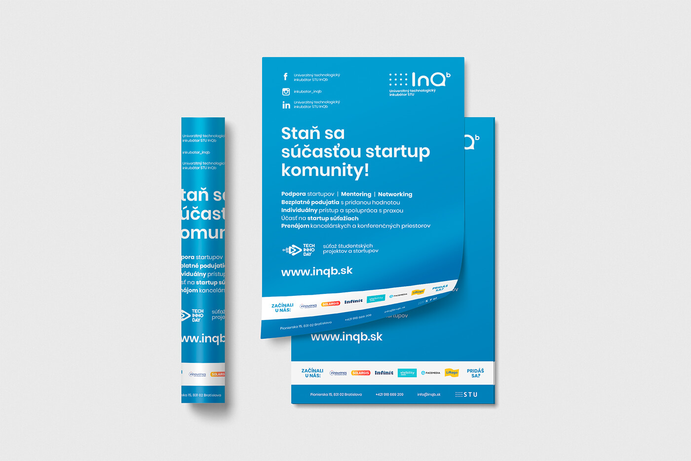
IN. Q. b.
The name gave us the foundation for the new logo.
IN is exactly what it sounds like. You’re in this place.
Q becomes the place itself—a visual placeholder for the incubator where ideas are being developed.
b introduces the idea of growth.
Together, the mark becomes less about simply spelling inQb and more about what happens inside it:
You come in with an idea. Something grows from it.
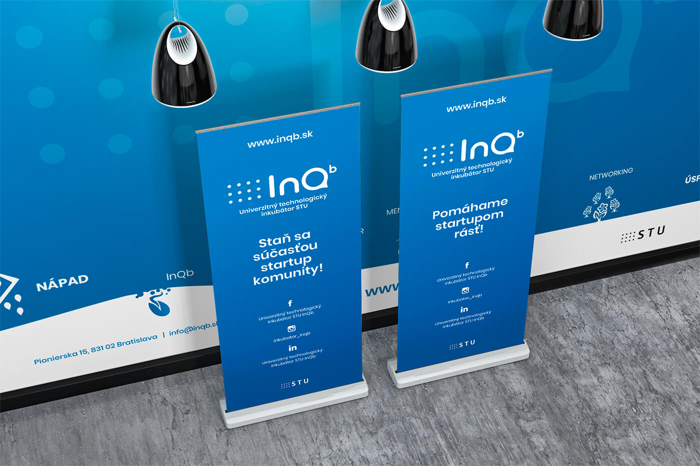
Something happens in here.
That idea of Q as a place became particularly useful for the identity.
InQb isn’t the final destination.
It’s the environment where something gets to happen.
An idea enters.
It gets questioned.
Tested.
Developed.
Turned into a prototype.
Turned into a business.
Eventually, it can leave the incubator ready for a world much bigger than the university around it.
Q is the space in between.
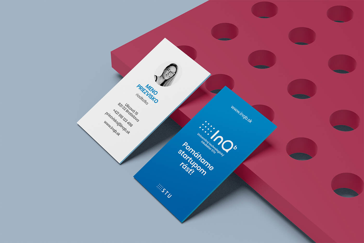
One incubator. Many things happening inside.
InQb isn’t only one program or one event.
There are workshops, startup activities, education and different initiatives happening throughout the year.
So the identity needed enough flexibility to accommodate them without every piece of communication looking unrelated.
The core identity stays recognizable while different colors can distinguish different events and activities.
Same inQb. Different things happening inside.
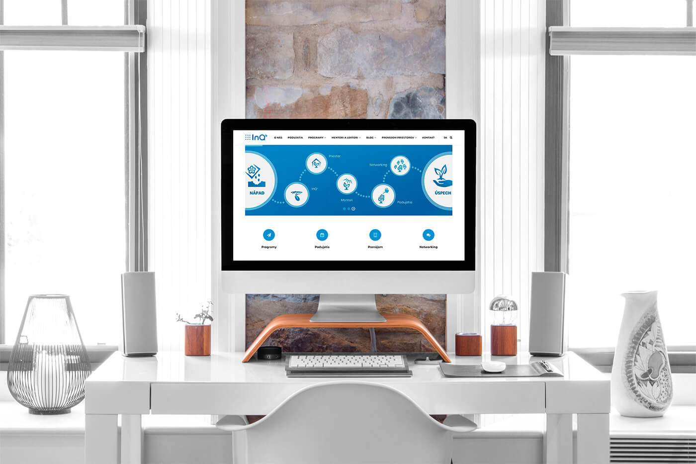
Technical doesn’t have to look institutional.
The organization sits in an interesting place.
University on one side. Technology and entrepreneurship on the other.
The visual identity needed to belong to both.
We kept it clean and intelligent enough to retain the credibility of an academic institution, while making it younger and more flexible for the students, researchers and future founders actually using inQb.
The result feels connected to where these ideas come from—without looking like they have to stay there.
What we worked on.
Logo redesign
Rebuilding the inQb identity around the existing name while creating a stronger visual idea for what happens inside the incubator.
University connection
Finding the right balance between a distinctive inQb identity and its relationship with the Slovak University of Technology.
Visual identity
Creating a modern, technical and youthful system around typography, the Q, existing university cues and the established light-blue color.
Flexible event system
Extending the core identity with additional colors so different activities and events could have their own expression without leaving the inQb brand behind.
Ideas come in. Companies come out.
InQb exists for the space between having a technical idea and knowing what to do with it.
We gave that space an identity.
INQB · LOGO & VISUAL IDENTITY BY WISITLike what you see?