
Hard to miss. Kind of the point.

AMOSFEST is the student festival of Comenius University in Bratislava, bringing together sport, education, culture and music.
For the 2019 edition, we created an identity designed to do one thing particularly well.
Get noticed.
Turn the color all the way up.
AMOSFEST changes its identity every year. For 2019, we didn’t need a complicated visual metaphor.
We wanted color. A lot of it.
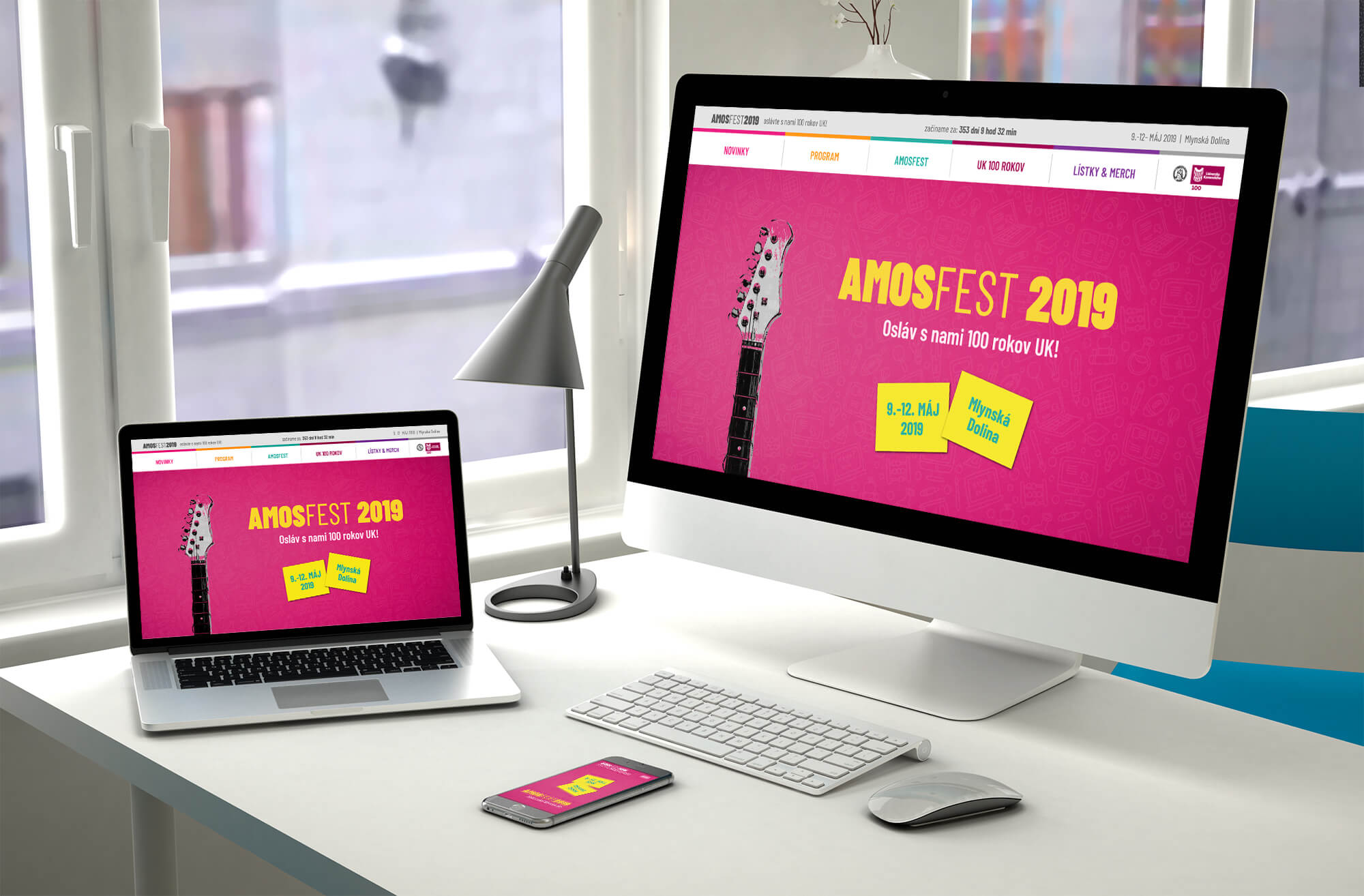
Bright pink and yellow became the foundation of an identity designed to feel young, energetic, summery and a little bit wild.
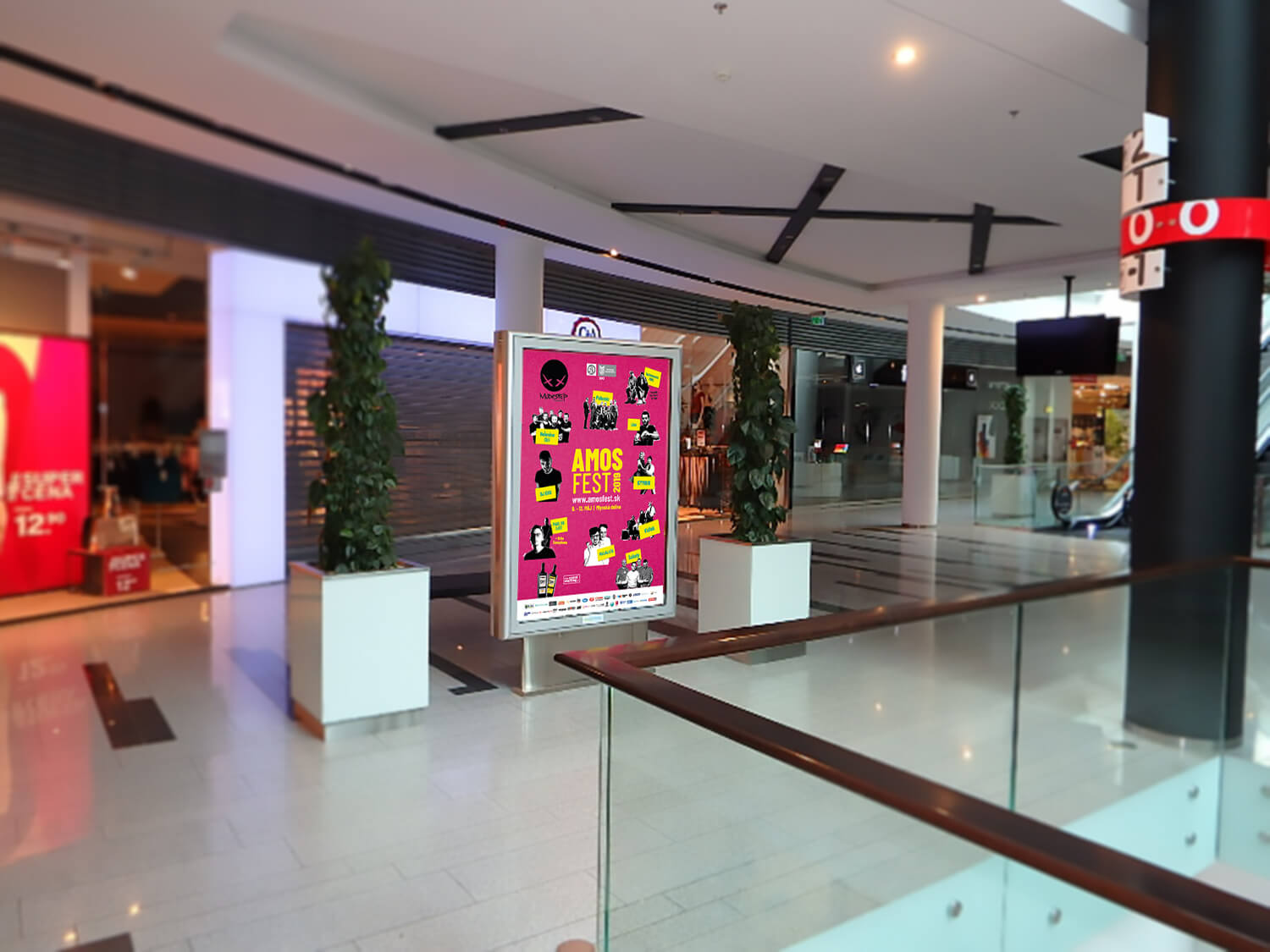
On your way to university.
From the other side of the street.
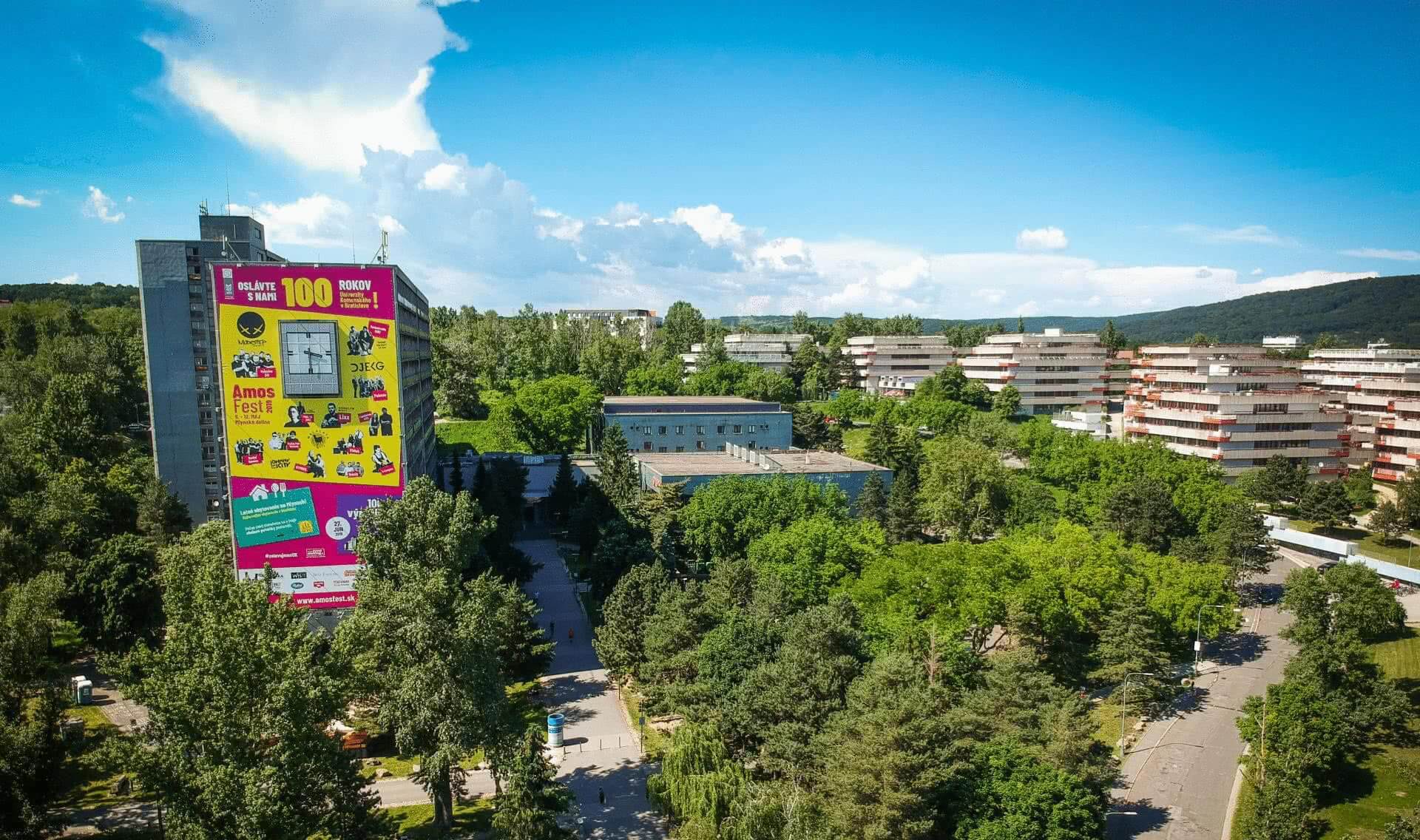
On the side of a very large building.
Pink. Yellow. Black. Repeat.
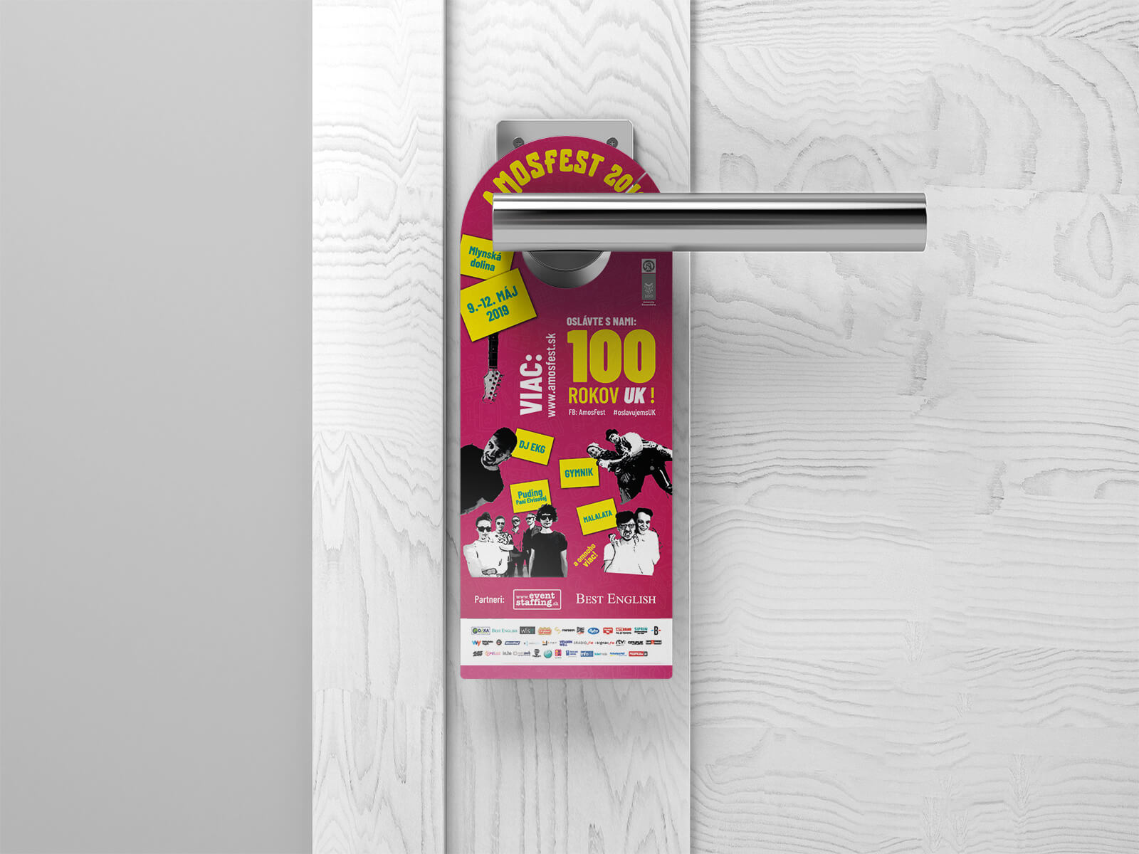
The campaign paired black-and-white photography of the festival’s performers with intense pink backgrounds and bright yellow notes.
Simple ingredients gave us a visual system that could be repeated again and again without disappearing into the background.
Different performer.
Different information.
Same AMOSFEST.
Recognizable from a phone screen to a billboard. Energetic enough to feel like somewhere you’d actually want to spend the day.
34 × 16 metres.
Some designs live on Instagram. This one ended up on a building.
One of the largest applications of the identity was a 34 × 16 metre banner—544 square metres of AMOSFEST that you really couldn’t scroll past.
The campaign also appeared across billboards, shopping malls and other spaces around the city. A two-color identity suddenly had a very big canvas.
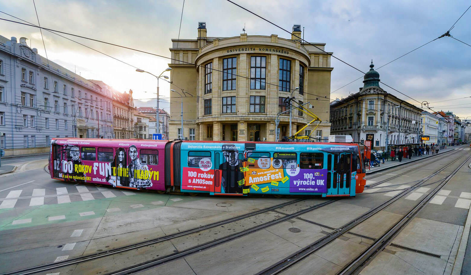
Next stop: AMOSFEST.
The tram was another chance to take the identity beyond traditional festival advertising.
Pink. Yellow. Performer photography. Now moving through the city.
Together with outdoor banners and billboards, it meant the campaign wasn’t confined to the university campus.
For a while, AMOSFEST became part of Bratislava itself.
From the city to the screen.
The identity had to work just as well at much smaller sizes. We carried the same visual language through the festival website, social media campaign and ticketing materials.
No separate digital personality. No completely different campaign once you opened your phone. Just the same loud visual world, adapted to wherever people encountered AMOSFEST.
100 years with AMOS.
2019 marked Comenius University’s centenary. Its anniversary communication used a related visual language, so a hundred years of university history could sit naturally alongside the wider campaign—presented with considerably more pink than usual.
What we worked on.
2019 visual identity
A bold pink-and-yellow visual language for that year's edition of the festival.
Campaign concept
High-impact color, black-and-white performer photography and simple graphic elements.
Performer visuals
Stylized imagery that became one of the campaign's most recognizable elements.
Outdoor campaign
Billboards, shopping malls, city banners and a 34 × 16 metre building installation.
Tram design
A full application of the campaign across a Bratislava tram.
Digital
The same identity across the website, social media and online communication.
Festival materials
Tickets, merchandise, stages and the materials used throughout the event.
A little difficult to ignore.
From a social post to 544 square metres of building.
AMOSFEST 2019 gave us plenty of room to see just how far two very loud colors could go.
AMOSFEST 2019 · IDENTITY & CAMPAIGN BY WISITLike what you see?